Advanced 3D | 3D Project
Naim Zuki
LECTURES
BRIEF
ADVANCED 3D
REFLECTION
AND222 | Advanced 3D
Chris Mcquillan
28/09/2021 - 26/08/2022
LECTURES
Week 1 | Introduction to Advanced 3D and the
following assignments
In the animation and game industry, 3D animations and assets have been gaining
popularity over the past couple of decades, from its use in feature animation
films, to visual effects, and in various video games. In this era, you'll see
3D artworks practically everywhere you go. So to prepare us for the animation
and game industry, AND222 Advanced 3D will cover the basics of creating a 3D
character, environment, and prop as a foundation for our future 3D projects in
year 3 and all other projects past university.
This module extends over the entirety of Year 2 and there will be a big
deadline at the end of the year which involves a 3D character, a 3D
environment, a 3D prop, and a performance-based animation practice.
BRIEF
Module Guide: AND222 Advanced 3D
<iframe
src="https://drive.google.com/file/d/1_IEoQcyh4usq54rVjcbgscDrA1cKFdfU/preview"
width="640" height="480" allow="autoplay"></iframe>
ADVANCED 3D
It was pretty intimidating walking into the animation studio for the first
time and seeing everybody pretty much being comfortable using these big
drawing tablets. Back in Malaysia, pretty much everybody had little to no
experience using any 3D softwares so 2D designs were our strong cards and
where we had most practice in.
With that in mind, I had a small talk with Chris letting him know where my
current skill level is, especially the fact that I haven't done any drawing
for the past 6 months so it might take some time for me to pickup the skill
again and be on track with everyone else on the assignments. He reassured me
on the expectations and advised me to just go at it with my own pace, which I
appreciated.
Idea Exploration
During class, I explored different styles for 3D art and tried my hand at
drawing to see where my skills are at right now. The early concept sketches
for this assignment mostly involves a very sketchy and ink-spilled style
inspired by Su Jian's concept arts. Knowing the characters would be the most
difficult for me to execute, I focused solely on character concepts for now
Fig. 1.0, Character Concept Sketch
Fig. 1.01, Character Concept Sketch
Fig. 1.02, Character Concept Sketch
Thinking about the character costumes, I recalled a video that I found from
Knight Zhang
explaining the thought process that she uses when designing any new
characters. So I had a thought about who I wanted this character
to be. Should it be leaning towards fictional or historical? What personality
will my character have? I mulled over the idea for a few days until I realised
that these ideas aren't appealing to me because it doesn't feel personal to
me. Realising that, I decided to design a character that would pay homage to
my highschool days. The typical white shirt over green pants and a pair of
white shoes, it felt like the perfect motivation for me.
Moodboard & Visual Development
The style I was aiming for when thinking about my 3D character leaned more
towards a stylised look. I particularly liked this design that I found on
twitter.
It had the right balance of stylised elements and realistic proportions. I
liked the way the character had that cool oversized tee look and I stuck to
that idea while creating my moodboard for my character.
Fig. 1.03, Character concept moodboard, (Image courtesy of various
artists)
A lot of concepts was explored at this stage of the project. We were paired
with a student from the game development course to help us build more about
the story behind our character, environment, and prop. From this activity, I
decided that I wanted to create an emotional character with a moody physical
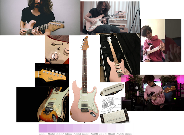
outlook, kind of like Max from Life is Strange. For the prop, I figured a pink
guitar would look nice considering I know the anatomy of guitars well and that
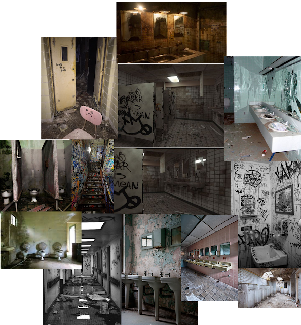
might help me in the modelling process. Finally, to pair the two together, I
thought creating a moody and dirty public toilet would fit the moody teenage
look.
Fig. 1.04, Guitar Prop Moodboard, (Image courtesy of various sources)
Fig. 1.05, Environment Moodboard, (Images courtesy from various
sources)
Character Design
Following Chris' classes on designing a character based on moodboards, I
experimented with a lot of different angles, face shapes, gender, hair styles,
and most importantly clothing. I realised that my character idea can be vague
considering the mundane outlook it had. Thus I had a lot of room to
experiment.
Fig. 1.06, Character concept
Fig. 1.07, Character concept
Fig. 1.08, Character concept
Fig. 1.09, Character concept
Fig. 1.10, Character concept
Fig. 1.11, Character concept
Fig. 1.12, Character concept
Fig. 1.13, Character concept
Fig. 1.14, Character concept
Fig. 1.15, Character concept
Fig. 1.17, Character concept
Fig. 1.18, Character concept
Fig. 1.19, Character concept
Fig. 1.20, Character concept
Fig. 1.21, Character concept
Fig. 1.22, Character concept
Fig. 1.23, Character concept
Fig. 1.24, Character concept
Fig. 1.25, Character concept
At this point I've created so many iterations of the same character that I've
started to lose sight of the original design. Perhaps I overthink too much
about the design process, so I decided that I'd try starting the sculpting
process for my character. Now following the ideal character design
process, making a character turnaround sheet would speed up the 3D sculpting
and modelling process. So I tried my hand at making it.
Fig. 1.26, Character Turnaround Sheet
Unfortunately, making this sheet took about weeks to finish after having to
learn proper anatomy for the 3D sculpting process. It was quite frustrating
and I am now realising the mistake I made of choosing to make a human
character as my first 3D project. But nothing prepared me for the
actual modelling process.
I've been trying to use Maya for about month at this point and although I'm
making some progress, I felt like the resources and knowledge about Maya
aren't as accessible as resources for Blender are. For that, I switched to
Blender for the character design process and it flowed much easier.
Fig. 1.27, Character face sculpt first try
This was quite a funny attempt, I think. Although the character was missing
some cheek, I think it's got some real character. After a few more failed
attempts at the head, I started to understand Blender's sculpting and
modelling flow that they've made with their new 3.2 update. So I managed to
model a head!
Fig. 1.28, Head sculpt in Blender
Looking up some tutorials online, I experimented with hair for this character.
The hardest thing I find about modelling the hair was finding the right
balance for both volume and interesting shapes that compliments the
character's face. I looked through my sketches and other references for hair
and couldn't come up with anything substantial for my character, so I decided
to leave that for after I finished sculpting the body.
Fig. 1.29, Failed hair sculpting attempt
Fig. 1.30, Body Sculpt
Fig. 1.31, Body Sculpt
Fig. 1.32, Body Sculpt
Fig. 1.33, Body Sculpt
Fig. 1.34, Body Sculpt
Fig. 1.35, Body Sculpt
Unfortunately at this time in the semester, it was coming to the last third of
the time I've had left before the deadline and there was still so much to do
and learn for this specific character. All the things including sculpting
clothes, texturing skin, and painting skin weights for rigging, it was too
much to think about and there just wasn't enough time for me to personally
achieve that. It saddened me to abandon this character but the deadline was
coming up and it was a lot of effort to create such an organic character.
Going back to the drawing board, I had to manage my expectations and pick a
character that would make it for the deadline. Since organic characters are
too hard for me, I realised I could make a box-y or robotic character.
Fig. 1.30, New character moodboard
Fig. 1.31, New Character Sketch
Fig. 1.32, New Character Early Modelled Look
After further modelling and refining, I was unable to finish the character and
unfortunately had to submit an unfinished 3D model of my character. I tried my
best to model it with intention but I didn't have enough time to texture and
UV wrap the character.
Environment Design
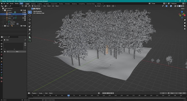
Not having much time on the clock, I started modelling an environment in
blender without having much drawn reference. But I knew enough about how to
create natural scenes for environments after growing up around the country
side. To make things interesting, I recently recalled the concept of monoliths
and how even in simple environments, having one object that stands out from
the environment would help with composition a lot. So I tried some ideas with
monoliths. I downloaded some free blender assets from different websites to
help aid the design process.
Fig. 1.34, Environment Draft Model
Fig. 1.35, Adding trees using some free assets online
Fig. 1.36, Experimenting with different shades and camera placement
Geometry nodes made me realise that there is way too much to learn in such a
short amount of time. So I had to once more opt out for an even simpler
design. But I didn't want this to be a repetition of the character problem, so
I put some extra effort to make it presentable for submission.
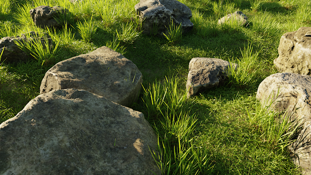
Fig. 1.37, New Environment Design
Miraculously, I managed to wrap it up nicely for submission and even managed
to render this nice photo for the blog. The render took around 2 to 3 hours in
total which was worth the wait.
Prop Design
For prop design, I just thought of giving my lil robot a cool katana because I
think he deserves it after being left unfinished like that. So I modelled it
out and managed to texture the blade using some free textures from Poliigon.
Fig. 1.39, Katana Model
Fig. 1.40, Katana Model up-close
Fig. 1.41, Katana Model textured
REFLECTION


Comments
Post a Comment