Advanced Typography | Task 1
29/03/2021 - 26/04/2021 (Week 1 - Week 5)
Naim Zuki, (0346615) | Bachelor of Design (Hons) in Creative Media
Advanced Typography
Task 1
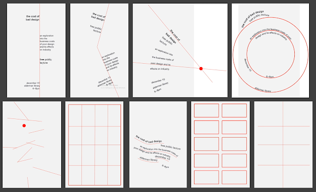
Fig. 1.0, 8 Different Typography Systems, (from upper left to bottom right) Axial, Radial, Dilatational, Random, Grid, Transitional, Modular, and Bilateral; (Images courtesy of Type 365)

Fig. 1.01, Adrian Frutigen in Interlaken, 2004, (Image Courtesy of Jurgen Siebert)

Fig. 1.02, The Five Things You Should Know About Matthew Carter, (Image Courtesy of Jack Newsham)

Fig. 1.03, Edward Johnston, 1902, (Image Courtesy of Wikipedia)

Fig. 1.04, Celebrating 100-Years Of London Underground's Iconic Font, (Image courtesy of TypeRoom)
INSTRUCTIONS
Module Information Booklet: Advanced Typography
<iframe src="https://drive.google.com/file/d/1-tJ4lBOSlgGniAxdZZmL8sOEkwL_rsv7/preview" width="640" height="480"></iframe>

Fig. 1.01, Axial System First Draft, 29/03/2021

Fig. 1.02, Axial System Progression, 01/04/2021 - 02/04/2021

Fig. 1.03, Radial System Progression, 01/04/2021 - 05/04/2021
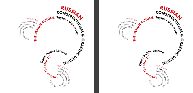
Fig. 1.04, Dilatational System Progression, 05/04/2021
 Fig. 1.05, Grid System Progression, 05/04/2021
 Fig. 1.06, Modular System Progression, 05/04/2021


Fig. 1.08, Random System, 05/04/2021

Fig. 1.09, Bilateral System, 05/04/2021

Fig. 1.10, Axial System Progression 06/04/2021

Fig. 1.11, Radial System Progression 08/04/2021

Fig. 1.12, Dilatational System Progression, 08/04/2021

Fig. 1.13, Random system Progression, 08/04/2021
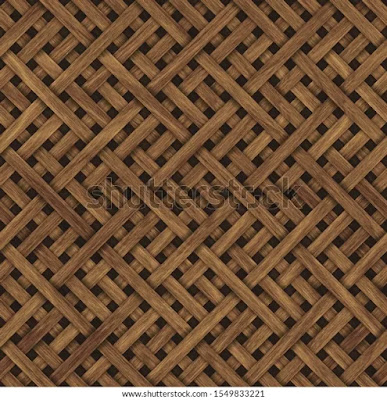
Fig. 2.0, Carved Geometric Pattern on Wood, (Image Courtesy of Shutterstock)

Fig. 2.01, Traced Wood Texture, 12/04/2021

Fig. 2.02, C, 12/04/2021

Fig. 2.03, E, 12/04/2021

Fig. 2.04, F, 12/04/2021

Fig. 2.05, H, 12/04/2021

Fig. 2.06, I, 12/04/2021

Fig. 2.07, L, 12/04/2021

Fig. 2.08, A, 12/04/2021

Fig. 2.09, T, 12/04/2021

Fig. 2.10, Y, 12/04/2021

Fig. 2.11, Extracted Letterforms, 12/04/2021

Fig. 2.12, First Iteration, 12/04/2021

Fig. 2.13, Second Iteration, 12/04/2021

Fig. 2.14, Third Iteration, 16/042021

Fig. 2.15, Fourth Iteration, 16/042021

Fig. 2.16, Fifth Iteration, 20/042021


Fig. 2.20, E, 16/04/2021


Fig. 2.23, First and Final Iteration comparisons, 26/04/2021
Task 1B | Type & Play Part 2

Fig, 3.0, Experimentation, 19/04/2021

Fig. 3.1 Experimentations, 20/04/2021 - 26/04/2021

Fig. 3.2, Progression, 26/04/2021 - 30/04/2021

Fig. 3.3, Final Edit, 30/04/2021
Week 1
Specific Feedback
Naim Zuki, (0346615) | Bachelor of Design (Hons) in Creative Media
Advanced Typography
Task 1

LECTURES
Lecture 1 | Typography Systems
Typographic Systems is a term that shares some values with the
architectural term shape grammars. A shape grammar is a set of rules that apply in a step-by-step way to
generate a set, or language, of designs. Shape grammars are both descriptive
and generative. The rules of a shape grammar generate or compute designs, and
the rules themselves are descriptions of the forms of the generated design
(more on the hyperlink). Therefore, in Typography, there are eight
major rules (or systems) that come with an infinite
number of permutations. Those rules are axial, radial,
dilatational, random, grid, modular, transitional,
and bilateral.
The Axial System places elements of the
design to the left or right of a single axis, this axis can be turned
and rotated extensively, but there can never be more than one axis. The Radial System extends the elements from a focal point, unlike the axial
system, the radial system can have multiple focal points within a design. The
Dilatational System expands the
elements from a central point in a circular fashion. The Random System appears to have no specific pattern or relationship (see also,
Ordered Chaos). The Grid System follows the
divisions of vertical and horizontal lines. The
Transitional System is an informal
system of layered banding. The
Modular System constructs the non-objective elements in standardized units. Finally, the
Bilateral System arranges the elements symmetrically on a
single axis.

Fig. 1.0, 8 Different Typography Systems, (from upper left to bottom right) Axial, Radial, Dilatational, Random, Grid, Transitional, Modular, and Bilateral; (Images courtesy of Type 365)
_
Lecture 2 | Typographic Composition
Typographic Composition refers to the textual arrangement in a
given space. It is how the designer presents the information to the consumer.
We as designers might want to appeal to the very familiar composition rules of
Design Principles (i.e. Emphasis, Motion, Repetition, etc). Although some
principles are easier to apply in typography than others, these abstract
notions can be ambiguous and seem more relevant
to imagery with their than the complex units of information
that is typography. Therefore, the following are some examples of typographic
composition techniques that provides a homogenous feel to a typographic
design.
The Rule of Thirds is a composition rule that's derived from photography. Its concept is
essentially to divide the frame (in our case that's the page, space, etc) into
three horizontal and vertical segments; where the intersecting
lines between the horizontal and vertical guides are used as focal points for
the design. The Grid System (from
typographic systems) has been used so much in typographic composition that
it's now come to be termed as the
Swiss (Modernist) Style of Typography that gives this system merit
in its amount of permutations, hence making it such a pragmatic system for
designers to structure their design.
Conversely, Chaos is a composition
technique that questions the Grid System by introducing asymmetry, randomness,
repetition, dilatational, radicalism, and madness; all of which adds
excitement and uniqueness to typographic design.
Environmental Grid, on the other hand, is
based on the exploration of an existing structure or numerous structures
combined, creating a unique super-structure that emphasises curved and
straight lines as visual stimuli.
Forms & Movement is another
exploration of the grid system, where objective and non-objective elements are
composed in such a way that makes the flipping of the page (whether paper or
screen) flows from one to the other, utilising visual connection as its key
element in the entire spread.
_
Lecture 4 | Designing Type
Type design in and of itself is nothing less of an art form. As a matter of
fact, the very continuation of production of different fonts is clear evidence
that type designer uses type design as a mean of artistic expression or
fulfilment of responsibility to improve an existing font. Putting it that way,
type design is a very human expression.

Fig. 1.01, Adrian Frutigen in Interlaken, 2004, (Image Courtesy of Jurgen Siebert)
Adrian Frutiger is a renowned
twentieth-century Swiss graphic designer. His forte was typeface design and he
is considered responsible for the advancement of typography into digital
typography. Frutiger, one of his valued contributions to typography, is
a sans serif typeface designed specifically for the newly built Charles de
Gaulle International Airport in France. What's interesting about this typeface
that we can use as a reference study is how clear-cut the purpose of the
typeface is. Frutiger was instructed to create a new typeface that is clean,
distinctive, and legible that is easy to read from both close-up and far away;
it needed to be recognised even in poor light condition or when the reader is
quickly moving past the typeface (eg. driving past signage). He took the
instructions given to him and embedded the typeface's purpose into its
creation, thus resulting in a highly functional and pleasing typeface.

Fig. 1.02, The Five Things You Should Know About Matthew Carter, (Image Courtesy of Jack Newsham)
Matthew Carter is the son of Harry
Carter, Royal Designer for Industry, contemporary British type designer and
ultimate craftsman. Carter trained as a punchcutter at Enschede by Paul
Radisch, responsible for Crosfield's typographic program in the early 1960s,
Mergenthaler Linotype's house designer 1965-1981. Much like Frutiger's success
in creating a font that adheres to its purpose, Carter is also well known for
creating fonts that address specific technical challenges. For example, he
designed Verdana (1996) for Microsoft with the purpose of the font to be
extremely legible even at very small sizes on the screen, the font also has to
exhibit characteristics derived from the pixel rather than the pen. The result
is a typeface that, when examined closely, has hints of "grey" that is called
Hints Of Verdana.

Fig. 1.03, Edward Johnston, 1902, (Image Courtesy of Wikipedia)
Edward Johnston is the creator of the iconic
London "Underground" typeface, which would later be known as "Johnston Sans"
(1916). The fascinating thing about Johnston's typeface that sets it apart
from the rest is its harmonious combination between the modern and the
traditional. The modern comes from the elegant and simple outlook
of the sans serif typeface, while the traditional came from
Edward's use of the classical Roman capitals for the proportions of his
typeface.

Fig. 1.04, Celebrating 100-Years Of London Underground's Iconic Font, (Image courtesy of TypeRoom)
The
General Process of Type Design usually
covers five steps. The first is Research, where the designer must
understand type history, anatomy, conventions, terminologies, side-bearing,
metrics, hinting, and so forth to ensure that the design adheres optimally to
the purpose of creation. Next is Sketching, whether digital or
traditional, sketching gives the designer an opportunity to record ideas
before further developing them. Then comes Digitisation, where the
sketches are refined into proper form and counter-forms in software such as
FontLab and Adobe Illustrator. After that, Testing the typeface
for refinement and correction comes crucial in developing a readable and
legible typeface. Finally, Deploying a completed typeface would
mean that the teething problems will become more obvious, thus the task of
revision doesn't end upon deployment.
_
INSTRUCTIONS
Module Information Booklet: Advanced Typography
<iframe src="https://drive.google.com/file/d/1-tJ4lBOSlgGniAxdZZmL8sOEkwL_rsv7/preview" width="640" height="480"></iframe>
Task 1A | Typographic Systems
For our first exercise of the semester, we're tasked to create a design for
each typographical systems with a given set of information. The information
given includes an event title, the event organiser, the event schedule, the
names of the speakers, and finally the venue.
Thankfully prior to the semester, I received requests to design some posters
for friends and family, so starting this exercise was easier than I thought. I
chose the title Russian Constructivism and Graphic Design and
began toying with the axial system. I wanted to keep everything in accordance
with the title; so I emphasised the colour red, bold diagonal lines, and heavy
typefaces.

Fig. 1.01, Axial System First Draft, 29/03/2021
After that, I started designing with the other systems while trying to keep
the same Russian Constructivism style. Since I was new to most of the systems,
I reached out to friends and family for their opinions on my designs before
editing them further. Through that, my designs are more focused on readability
and function rather than experimental concepts.

Fig. 1.02, Axial System Progression, 01/04/2021 - 02/04/2021

Fig. 1.03, Radial System Progression, 01/04/2021 - 05/04/2021

Fig. 1.04, Dilatational System Progression, 05/04/2021
 Fig. 1.05, Grid System Progression, 05/04/2021
 Fig. 1.06, Modular System Progression, 05/04/2021

Fig. 1.07, Transitional System, 05/04/2021

Fig. 1.08, Random System, 05/04/2021

Fig. 1.09, Bilateral System, 05/04/2021
After the peer feedback session in class, I re-designed the axial, radial,
dilatational, and random systems accordingly. I designed them to enable better
readability as well as to adhere better to the respective systems. Although
for the radial system, I was enthralled by Sajiya Mir's work in class, so I
had to try my hand at the colour theme (considering the colours were similar)
and it turned out extremely well.

Fig. 1.10, Axial System Progression 06/04/2021

Fig. 1.11, Radial System Progression 08/04/2021

Fig. 1.12, Dilatational System Progression, 08/04/2021

Fig. 1.13, Random system Progression, 08/04/2021
Fig. 1.14, Typography Systems, Final Submission, 07/04/2021
_
Task 1B | Type & Play Part 1
Task 2A Part 1 is an exercise where the students are instructed to create a
font based on the students' chosen texture image. The steps that we're
required to take after choosing our image is analysing, dissecting, and
identifying potential letterforms within the dissected image. The forms would
be explored and ultimately digitised in a process of iteration that requires
the letterforms to go from being crude to refine.

Fig. 2.0, Carved Geometric Pattern on Wood, (Image Courtesy of Shutterstock)
For my type & play letterforms, I've decided to extract my letters from
this image of a rattan texture. The diagonal lines, geometry, and overlapping
motif make it an interesting subject to explore for my letters. I started by
line tracing the texture on Photoshop using the brush tool to analyse the
texture thoroughly, finding where the wood overlaps and where it separates.
Then I began by dissecting the letterforms. I ended up identifying nine
letterforms in total.

Fig. 2.01, Traced Wood Texture, 12/04/2021

Fig. 2.02, C, 12/04/2021

Fig. 2.03, E, 12/04/2021

Fig. 2.04, F, 12/04/2021

Fig. 2.05, H, 12/04/2021

Fig. 2.06, I, 12/04/2021

Fig. 2.07, L, 12/04/2021

Fig. 2.08, A, 12/04/2021

Fig. 2.09, T, 12/04/2021

Fig. 2.10, Y, 12/04/2021
I then exported these sketches onto Adobe Illustrator for refinement and
testing. I imagined the nature of the letterforms to be sans serif given the
geometric structure of the wooden texture, so I began by using the pen tool to
trace the letters and begin my iteration process.

Fig. 2.11, Extracted Letterforms, 12/04/2021

Fig. 2.12, First Iteration, 12/04/2021

Fig. 2.13, Second Iteration, 12/04/2021
During the feedback session in class, my classmates pointed out that the
letters E, A and Y felt quite out of place. So they suggested that I make my
letters more consistent and refine the edges to give it a refined final
look.
Taking their feedback in, I decided to play around with diagonal lines and
implemented roman capitals in the construction of my letters for consistency.

Fig. 2.14, Third Iteration, 16/042021

Fig. 2.15, Fourth Iteration, 16/042021

Fig. 2.16, Fifth Iteration, 20/042021

Fig. 2.17, A, 16/04/2021

Fig. 2.18, H, 16/04/2021

Fig. 2.19, F, 16/04/2021

Fig. 2.20, E, 16/04/2021

Fig. 2.21, Y, 16/04/2021

Fig. 2.22, Complete Progression, 16/04/2021

Fig. 2.23, First and Final Iteration comparisons, 26/04/2021
Fig. 2.24, Type & Play Part 1 Final Submission, 26/04/2021
In this exercise, students are tasked to combine a visual with a
letter/word/sentence of their choosing. The objective is to enhance the
selected visual. The text must be woven into a symbiotic relationship with the
image. I began the exercise with a few sketches for idea generation.

Fig, 3.0, Experimentation, 19/04/2021

Fig. 3.1 Experimentations, 20/04/2021 - 26/04/2021

Fig. 3.2, Progression, 26/04/2021 - 30/04/2021

Fig. 3.3, Final Edit, 30/04/2021
Fig, 3.4, Type & Play Pt. 2 Final Edit, 30/04/2
_
FEEDBACKS
Week 1
Specific feedback:
My design was quite appealing to my classmates and they complimented the
composition of my work. Although, they mentioned that the body text I've
used was too small to read and suggested i use a different font.
General Feedback:
Mr. Vinod's general feedback centred around a few things. One was the use of
extreme diagonal lines that reduces the readability of a text. Next, he
commented on the misuse of extreme contrast of colouring one side of the
page a solid colour while the other is blank. Finally, he noted that we all
should do a little more research on how the systems work in order for us to
use them properly.
Week 2
Specific feedback:
The hierarchy of information in every page was done properly; adheres to the
requirements of the exercise. In some of the designs, the introduction of
colours are redundant; the weightage of certain elements does not need the
introduction of colours. My interpretation of the axial system doesn't
conform to the definition of the definition of the system. Axial system has
not more than one axis. My work for the bilateral system can be labeled as
multilateral system. This can only be accptible given that the function
makes sense.
General Feedback:
To create proper borders of each artwork, create borders for each pages with
a 0.5 stroke width. Colour is only introduced to enhance a design, not for
decorative purposes. Make sure to question if any non-objective elements
have purpose and if the purpose is clear. Update portfolio. For typefaces
that doesn't have small capitals, reduce the font size by 0.5 percent to add
unity and harmony to a design. Tweak leading, kerning, and leading to taste.
Make sure to differentiate between progress pictures and final submission in
portfolio.
Week 3
Specific Feedback:
First impression, they loved the interpretation of typefaces. It looked well
refined and developed. Although, the letters A and Y are quite unrefined, it
doesn't look clear as the letters they were. They suggested I experiment
with the stroke lengths. The width and height of the letters are quite
inconsistent. My blog was pretty empty and should be updated.
Geenral Feedback:
Notes on our blogs must be up to date. the more detailed the refining
process, the better the outcome will be. Although we would want to refine
our fonts as much as possible, too much refinement could lead to the font
losing it's original qualities. So we might want to take a step back and
look at the font as a whole before deciding the final outcome.
Week 4
Specific Feedback
My peers loved how the letterforms turned out, they prefer the latest
rendition the best. They questioned the letter Y, which looks too much like
an X and prompted me to try again so it looks like an X. Mr Vinod
complimented my work well, however, he commented that the spacing I added
for diagonal lines was too small. He explained that these spaces are usually
measured in comparison with the letters' stroke width.
General Feedback
Although doing as many renditions as possible is a meritable effort, we
might want to take a step back to review our work as a whole and question
if the latest work is better than the previous works. Always question
whether our current letterforms maintain certain attributes and qualities
that the original tracing does.
Week 5
They looked through my work and couldn't really see where I was coming
from with my type and play ideas. Although there is a connection between
the word and the picture, it's not well incorporated enough to presenta
concrete idea.
General Feedback
The better examples picked out from class often overlaps elements of the
image onto the type the students included in the exercise. Balance between
the type and image needs to be highly considered when putting togehter the
composition.
_
REFLECTIONS
Week 1
Entering class hearing Mr Vinod's voice more cheerful than before was a
good start to the semester. This week's introduction class was pretty
chill at first but of course, no typography class finishes without any
form of exercise. However, I was really excited about the new peer
review system. I could see my classmates were awkward and reluctant/shy
when giving their opinions but at the end of the day, the experience was
way better than previously and I walked away with more thorough feedback
on my work that I can work on instantly after finishing
class.
Week 2
Right as the first week ended I could already feel the pressure of this
module weigh on me. Eight final designs by the second Monday? I need to
make sure I have enough coffee in my house if I'm gonna make it through
the following 12 weeks. Nonetheless, although my progress is slow due to
personal projects I have at the side (which I'm trying to finalise so I
can focus more in class), the exercise itself was a really insightful
look into how typography can be expressed. I'm obviously more in love
with the Axial and Radial systems, the Random System was expectedly hard
to wrap my head around but every other system were pretty straight
forward.
Week 3
Resubmerging ourselves into type design was really nostalgic. I find
that I had to revisit my old notes as well as external sources to
refresh my mind on the construction of a font. I was initially pretty
lost with what I texture I wanted to choose, but seeing the examples
shown in class gave a better idea of what to look for to create an
expected outcome for the exercise.
Completing Typographic Systems felt really refreshing. Although I
struggled to keep but, by the end of the exercise I felt like I was
regaining momentum in InDesign and Typography as a whole.
_
FURTHER READINGS
Comments
Post a Comment