Information Design | Exercises
05/01/2021 - 15/010/2021 (Week 1 - Week 2)
Naim Zuki, (0346615) | Bachelor of Design (Hons) in Creative Media
Lecture 6 | FLIP 3 Miller's Law of Chunking
INSTRUCTIONS
Module Information Booklet: Information Design

Fig. 2.05, Antique Map from Sekiro; Dark Souls 2 Map Fan Art; Mountain Stream Shrine Map
FURTHER READING
Naim Zuki, (0346615) | Bachelor of Design (Hons) in Creative Media
Information Design
Exercises
LECTURES
Introduction
Well, would you look at that, another year, another semester. To an absolute surprise to everybody, I woke up five minutes late to class; a wonderful
start to the semester. Jokes aside, it was good to hear Ms Anis' lectures
and how enthusiastic she was to start our classes and begin the short
semester. Mr Shamsul was also very supportive of the process and seemed
eager to begin the exercises and projects lined up for their students. It
was very refreshing to see the different dynamics of these two lecturers
compared to the classes I've had last semester and I'm loving the energy
this class has. Time to kick some project's butt.
Lecture 1 | Quantifiable Information
To kick-start the exercises for this semester, Ms Anis began explaining to
us what Quantifiable Information is by instructing us to look
for a jar in our house (or any object of measurable quantity) and
classifying its contents according to our desire. By doing so, she's
explaining that quantifiable information is
quantities obtained using a quantifiable measurement process. This
process also gave us the opportunity to learn how to visually present data
aesthetically.
_
Lecture 2 | Briefing on Project 2
After Ms Anis' lecture, Mr Faizal started his session by briefing us on our
group project: Project 2. For this semester, our given theme is
Disinformation. He explained that the final expected
outcome of the project is an animated infographic video, then proceeds to
start by asking the (already formed) groups to select their topics for their
infographic video. My group was placed as Group 1 and we chose the
topic of Disinformation on Covid-19 Vaccines.
For data collection, Mr Shamsul puts emphasis on the research process,
noting that the who, what, where, when, why, and how are
important questions to ask when collecting the data needed for our project.
As for the aesthetics of an animated infographic, there were loads of
similar rules applied from typography such as
contrast, alignment and symmetry, consistency, and structure.
_
Lecture 3 | FLIP 1 The Different Types of
Infographics
Within the next consecutive weeks, Ms Anis planned a lecture structure where
the groups would present certain topics to the rest of the class as a
learning session. This series of group presentations was named FLIP. My
group (along with group 2) received the topic of Different Types of Infographics. Ms Anis' intent with this FLIP topic was so that those students with
little to no design backgrounds can have a chance at learning some design
concepts and provide online resources for them to work. Thus, we were tasked
to do research on the different types of infographics and online websites
and resources to make them. In my group, I've chosen to review
Genial.ly. Below is the template I've chosen to redesign from Genial.ly and the outcome I made.
Fig. 1.02, FLIP 1: Different Types of Infographics and Online Tools, 12/01/2021
_
Lecture 4 | Animation in Adobe After Effects
As preparation for the final outcome of Project 2, Mr Shamsul started with a tutorial session on Adobe After Effects focusing on techniques used for Kinetic Typography. Some of the important notes I've taken are the number of animated effects available at our disposal, manipulating the positions of texts, and composition simple typography animations.
The term L.A.T.C.H was developed by an American architect and graphic designer named Richard Saul Wurman as a method of organising information. He claims that "Information can be infinite, however... The organisation of information as finite as it can only be organised by LATCH: Location, Alphabet, Time, Category, or Hierarchy".
As the concept entails, Location compares information coming from various sources (Atlas, Travel Guide, Parts of a System, etc). Alphabet is used for very large bodies of information that can be found in a lot of today's systems such as dictionaries, our phones, online guides, and etc. Time is used for events that occur over a fixed duration; it's easy to understand, easy to draw comparisons and conclusions. Category is executed by grouping certain characteristics of the data together with an accompanying indication. Lastly, Hierarchy assigns value or weight to the information by varying its characteristics such as its size in the composition, its placement, its colour, and so on.
_
In 1975, George Miller asserted that the span of immediate memory and absolute judgement were both limited to around 7 (± 2) pieces of information. In his paper titled, The Magical Number Seven, Plus or Minus Two: Some Limits on Our Capacity for Processing Information, he suggests that the number of perceptual chunks' an average human can hold in working memory (or short-term memory) is ~7 bits of information when completing a task that requires cognitive effort. Here's a summary of the article sourced from Wikipedia:
"In his article, Miller discussed a coincidence between the limits of one-dimensional absolute judgment and the limits of short-term memory. In a one-dimensional absolute-judgment task, a person is presented with a number of stimuli that vary on one dimension (e.g., 10 different tones varying only in pitch) and responds to each stimulus with a corresponding response (learned before). Performance is nearly perfect up to five or six different stimuli but declines as the number of different stimuli are increased. The task can be described as one of information transmission: The input consists of one out of n possible stimuli, and the output consists of one out of responses. The information contained in the input can be determined by the number of binary decisions that need to be made to arrive at the selected stimulus, and the same holds for the response. Therefore, people’s maximum performance on one-dimensional absolute judgement can be characterized as an information channel capacity with approximately 2 to 3 bits of information, which corresponds to the ability to distinguish between four and eight alternatives."
Chunking, or clustering, is the function of grouping information together with related by perceptual features. This is a form of semantic relation, such as types of fruit, parts of speech, or 1980s fashion. Chunking allows the brain to increase the channel capacity of the short term memory; however, each chunk must be meaningful to the individual. For example, the word p e n c i l is actually a 'chunk' of letters, organised into a perceptual gestalt. If the letters are rearranged to c n l i p e it would be more commonly perceived as six separate chunks of information.
In a design context, chunking is crucial when communicating information to the audience. The rule that comes in chunking is to always organise elements of information into categories no larger than 9, but preferably ~5 chunks. Here are a couple of basic examples of chunking information that can be applied in design:
_
Lecture 7 | FLIP 4 Manuel Lima's 10 Directives Manifesto
Manuel Lima is a Portuguese-America designer, author, and lecturer known for his work in information visualisation and visual culture. In his paper tilted Information Visualization Manifesto, he described 10 Directions for designers to practise in information visualisation. The following is a short summary of the directions included in his paper.
Forms Follow Functions describes that the purpose of the form of a visual is centred on explanation and unveiling. Start with a Question explains that every project should start with a question that has to be investigated and answered. Interactive is Key emphasises that any information visualisation project should not only facilitate understanding but also the analysis of the data, according to specific use cases and defined goals. Cite your Sources focuses on disclosing your research to your audience for credibility and authenticity. The Power of Narrative describes that conveying the message of a visual in the form of a narrative reaches the natural attraction we humans have towards storytelling. Do not glorify Aesthetics defines that aesthetics should be seen as a consequence of the visual but never its ultimate goal. Look for Relevancy stresses that creating a cohesive pattern in the visual would create a better understanding of the information presented. Embrace Time states that we should always consider time when our targeted system is affected by its progression. Aspire Knowledge explains that every project should aim at making the system more intelligible and transparent. Finally, Avoid Gratuitous Visualizations emphasises that information visualisation has to stay neutral in the given topic, any bias or personal opinion should not be presented in data visualisation.
_
INSTRUCTIONS
Module Information Booklet: Information Design
<iframe
src="https://drive.google.com/file/d/1zVQyrXVQJ17k747mzJW0GVjcxwFry3Rn/preview"
width="640" height="480"></iframe>
Exercise 1 | Quantifying Information
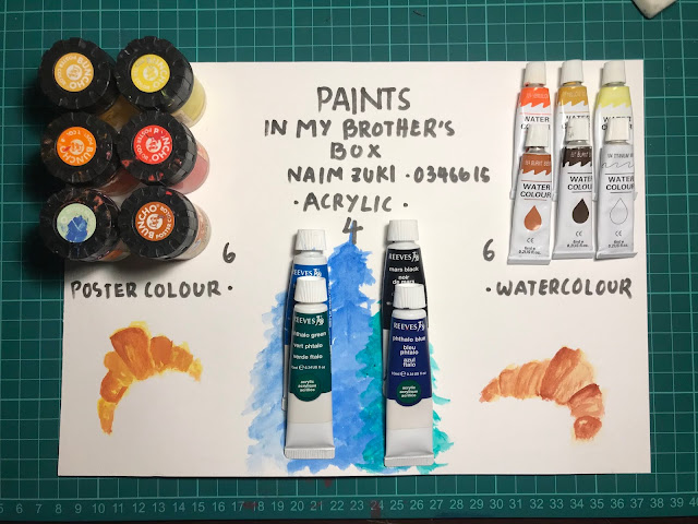
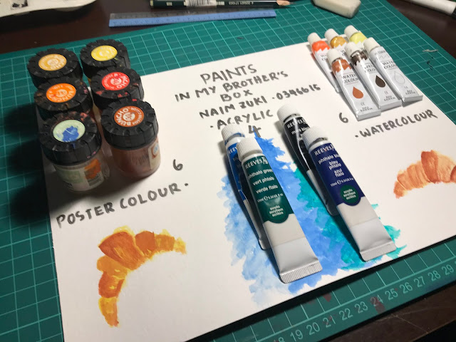
For our first exercise of the semester, we're tasked to compose an infographic using quantifiable materials that can be found in our house. My first thoughts were to arrange all the books I have according to the genre but that won't fit on an A4 paper. So I ravaged through my room and my brother's room (cause he's in another country hah sorry Older Brother) to see what I can use. Lo and Behold, I found his old stash of paints and voila began my process of quantifying old used paints.
I started by arranging the paints according to the medium to quantify the amount. As I laid everything out on my table, it was way too much to fit on the paper so I started narrowing down to an appropriate amount by using the ratio of paints between Watercolour, Poster Colour, and Acrylic. It came down to a rough estimate of 6 watercolours to 6 poster colours to 4 acrylics.
For the infographic, I decided that I wanted to paint the categories based on the medium so it would show the contrast between the different paints. It took me a while to think of something appropriate to paint but after some experimentation, I settled with painting food for watercolours and poster colours and foliage for acrylics.
_
Exercise 2 | L.A.T.C.H.
For our next exercise, we're tasked to utilise the L.A.T.C.H. concept and create a digital infographic based on a fandom of our choice. Now let me tell you when I geeked out at the brief, I really geeked out when I saw the works done in the previous semester. They were so creative and clean! So I was pretty excited to think about what fandom to choose.
During the semester break, I did what any other responsible and mature university student would do with their free time. That is play Sekiro: Shadows Die Twice from start to end and be completely obsessed with the story, lore, and fan arts. I am completely obsessed with that beautiful game. So obviously I had to choose that as my choice of fandom for this exercise (hehe). Before I began the ideation process, I went to look for inspiration.

Fig. 2.05, Antique Map from Sekiro; Dark Souls 2 Map Fan Art; Mountain Stream Shrine Map
(Images Courtesies of From Software Games, Judson Cowan, and Francesca Baerald)
I started my idea with creating a mood board to develop an idea of how I want the final outcome to look like. I planned to create an infographic about categorising the different types of Shinobi Prosthetic Tools available within the game, so I sketched out the Shinobi Prosthetics as a base for my final prosthetic design.
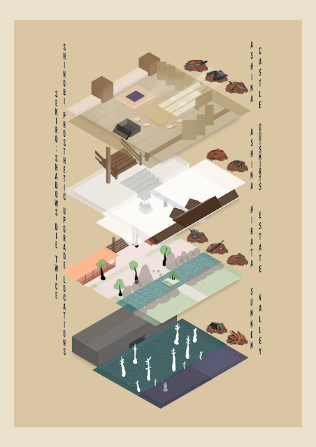
To my surprise, I realised that we're required to utilise four out of five of the LATCH rule, so I had to start my work from scratch considering I couldn't fit that amount of information with the idea I had. But I still wanted to show the different Shinobi Prosthetic Tools available in the game, so I decided to create an infographic showing the different locations of the Shinobi Prosthetic Tools throughout the game. As a little background information for the reader, the Shinobi Prosthetic is a mechanical arm that the main character of the game, Wolf, receives at the start of the game. The player can gradually upgrade the arm by finding the Shinobi Prosthetic Tools sprawled throughout the game.
In order to accurately draw out the maps, I had to do some visual research. So I booted up the game and travelled to the different key areas where the Tools can be found and took some screenshots. To which later I translated into sketches for my final design. I only had to take pictures from three out of the four areas I needed to include in the infographic because I had already memorised the Ashina Castle (more specifically the Castle Antechamber) layout by heart from all that grinding.
My main inspiration of style for this exercise is the old map drawing style from Old Japan (refer to Fig. 2.05). So I stylised them according to my taste and came out with the following.
Happy with the style and colour choices, I began painting and drawing the maps one by one, ensuring that I get the colours, layouts, and mood according to the original gameplay. Although, I decided to paint Hirata Estate without the fires because it was simply too hard to draw the dynamic lighting (I'm still an amateur, unfortunately).
Moving on to designing the actual infographic, I tried to incorporate the vertical Japanese Handwriting style into my fonts and had it typed out vertically. I also wanted to have a minimalistic look to convey the information without any excessive ideas.
In the final outcome, I arranged the hierarchy of information according to location by grouping the Tools according to the area it could be found, alphabets by having Ashina Castle at the top and Sunken Valley at the bottom, and category by arranging the prosthetics from the easiest to find to hardest to find in the given area.
_
FEEDBACK
Exercise 1
Ms Anis noted that the design was light-hearted and pleasing to look at. Her comment on the information, however, was that it was too little for it to pass as an infographic. She recommends that I add more information to make my work more engaging to the audience.
Exercise 2
My designs for this exercise was great, according to the grading. However, the same problem from the previous exercise persists, there was a lack of information in the posters, but otherwise, everything was fine.
_
REFLECTIONS
Exercise 1
Going back into painting after the semester break felt a little off. I had to go through a couple of practise runs with my paints before starting the final design, which was fun to do. I kind of miss painting for the heck of it. Although I was disappointed I couldn't fit as many paints on the paper, I'm happy with the results.
Exercise 2
This exercise was extremely fun to make. Designing the maps was an absolute treat and I didn't expect things to turn out so well. I wish I could have included more information but I didn't want to overcrowd the poster with irrelevant information. I was happy with the minimalistic design and I'm glad that my friends and family approved of the design as well.
_
FURTHER READING
 05/01/2021 - 15/010/2021 (Week 1 - Week 2)


Comments
Post a Comment