20/9/2020 - 10/11/2020 (Week 9 - Week 12)
Naim Zuki, (0346615)
| Bachelor of Design (Hons) in Creative Media
Typography
Project 2B
LECTURES
Lecture 7 | Screen & Print
Typography has evolved substantially within the past century with the introduction of computers. Now,
typographers are more digitally experimental and the democratisation of technology allows for countless of typography work being produced every day. But with all that change happening to the world of typography, how does that affect the public's view of typography? Or more importantly, how has typography itself changed? We'll be reviewing how type for print differs from the more contemporary type for screen.
Type for Print - Primarily, the type was designed intended for reading from print long before the screen. It's the designer's job to ensure that the text is smooth flowing and pleasant to read.
Type for Screen - Typefaces intended for use on the web are
optimised and often modified to enhance readability and performance on screen
in a variety of digital environments.
Hyperlink - A hyperlink is a word, phrase, or image that you can
click on to jump to a new document or a new section within the current
document.
Font size for screen - 16-pixel text on a screen is about the same
size as text printed in a book or magazine.
Static vs Motion typography
Static typography has a minimal characteristic in expressing words. Traditional characteristics such as the bold and italics offer only a fraction of the expressive potential of motion typography.
For motion typography, temporary media offer typographers opportunities to "dramatise" type for letterforms to become fluid and kinetic. Motion typography is often overlaid onto music, videos,
and advertisements or set in motion with rhythm.
_
Lecture 9 | Introduction to Typography: Expression, Hierarchy, and
Composition
Mr Vinod and Mr Shamsul introduced us to the next part of the
project, titled
Typography: Expression, Hierarchy, and Composition. Our task is to utilise the knowledge and experience gained in the
Exercises, Project 1, and Project 2A to express typographically a social message relevant to the campus community at Taylor's University or society at large. In this project, we're allowed to use minor graphical elements or visuals in our message and design. We may use one colour other than
black and white, and we must ensure that the message occupies approximately
3/4th of the space.
INSTRUCTIONS
Module Information Booklet
<iframe
height="480"src="https://drive.google.com/file/d/1XBaflX9nOKw7ogRHFAN_7-RNi-4_yu3j/preview"
width="640" ></iframe>
PROJECT 2B | Typography: Expression, Hierarchy, and Composition
Now that we have survived 9 weeks of Typography and gone through rigorous
training and practise in composition, exploring different techniques, and
experimenting with various concepts, we're in the endgame now. To put
everything I've learned within the past 10 weeks into practice, I began by
doing the first thing any project should start with: Idea Exploration.
 Fig. 1.0 - Fig. 1.04, Idea Inspiration, (Images courtesies of Made Up
Studio, Atelier Fwells, WRDBNR, Abo Akin, Division Designs)
During the idea pitching phase for this project, I got the idea of quoting lines from books because Ray Bradbury's Fahrenheit 451 was conveniently sitting on my bedside stool as I was dozing off from the fatigue. Thus, the spark of enlightenment rekindled the fire of motivation and I soon began scouring the books I've read for an impactful quote. Lo and behold, two books have made the cut, the first being the classic George Orwell's 1984 and the second being George R. R. Martin's A Song of Ice And Fire.
Henceforth, begins my creative process.
EARLY DEVELOPMENT
I started with a quote I found in 1984 and afterwards branched off to relevant quotes. Below are progressions made.
 Fig. 1.5, Early sketch for idea generation

Fig. 1.6, Developed Early Sketch
Having shown this idea to Mr Vinod & Mr Shamsul, they commented that
the concept and idea are acceptable and I may begin to work on this quote.
DESIGNING
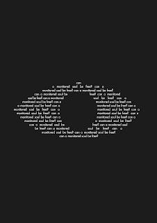
With this idea in mind, I refined the overall shape of the "eye" and made the
pupil blend well with the eye and idea of this poster.
 Fig. 1.7, Development on the First Idea
 Fig. 1.8, Development on the First Idea
Though after completing this design I felt unsatisfied with the overall outcome, it looks a bit too simple for my taste. The monotone colours bored me as well. It would be a waste if I didn't add colours to the only Typography project in the entire semester that we are allowed to use colours. So I abandoned the idea and came up with a couple more designs.
 Fig. 1.9, Development on the Second Idea
 Fig. 1.10, Development on the Third Idea
Fig. 1.11 - Fig. 2.5, Idea Exploration, 27/10/2020
At this point, I was pretty clueless with which quote and which poster
I should continue developing, and so I sought out my peer's opinions. After some days of pondering, I've come
to favour the quote from George R. R. Martin's books more, so I began more
experimentation.
In order to add more weightage to the words LION and
LANNISTER, I tried warping the phrases to see how I can express the
quote better.
 Fig. 1.12, Added warped perspective on the quote itself to
compose everything in a more consistent manner; The chosen colours are
based on the colours of House Lannister: Yellow and Red.
 Fig. 1.13, Upon feedback, I removed the word Lannister to
make it more universally comprehensive and relatable
The idea that I'm going for is the varying weightage between Lion and Sheep. By having more visual weight, the Lion seems strong, defined, distinguished, and solid.
As opposed to the small and meek sheep. Thus completing the quote
"A Lion doesn't concern itself with opinion of sheep." that was
famously said by Tywin Lannister to Jaime Lannister to remind him the
power of The Lannister House.
Upon consultation, I experimented with more ways to increase the weightage of
Lion.
 Fig. 1.14, Development of Poster
Afterwards, I sought out the opinions of others on the colours I've chosen and
gotten various feedbacks and suggestions that both confuses and intrigued me.
Nevertheless, I experimented more.
 Fig. 1.15, Colour Experimentation
 Fig. 1.16, Colour Experimentation
After doing as many variations of the posters as I can, I went to sleep to freshen my mind and took one more look at everything as a whole. From my own assessment, I've chosen the following as my final Poster.
 Fig. 1.17, Final Poster Submission, 03/11/2020
ANIMATING
Booting up After Effects on my computer, I didn't know what to expect from this software nor do I have a general idea of what I want to animate from that poster of mine. I went into After Effects completely blind and it felt like I
hit a brick wall. At first, the software prompted me with an error saying that it could not run properly with my current graphics card. Then, my imported files wouldn't load properly. After that, all my approach to animating the texts felt awkward and not what I had envisioned the process to be. It was terrible. It was like a nightmare.
What is this monstrously terrible software? Who built this ugly interface?
Why is it so claustrophobic? A whole array of panicked thoughts came and I had to spend the next few days researching methods, techniques, and everything I should know
about Adobe After Effects.
 Fig. 1.18, Poster Animation First Draft, 10/11/2020
After endless hours of troubleshooting, experimenting, googling, and
seeking for help from my friends, I finally got my Adobe AE to run properly. Then, I began reorganising the layers in my Illustrator file to
optimise it for AE editing (someone on youtube said that a good way of exporting an AI file is to organise every vector onto it's own individual layer).
 Fig. 1.19, Process of Preparing Layers for Export
 Fig. 1.20, Organised Layers for Complete Export
Thus, I begin my second attempt at animating in that beast of a software.
 Fig. 1.21, Imported Ai File
 Fig. 1.22, Reorganised Layers into separate Composition Layers for sake
of systematic animating
After spending an enormous amount of time experimenting the different effects available, researching interesting features and typography animating techniques, I caught a groove going and managed to gain a direction I
wanted to head into. Thus the following gif was born.
Much like the original concept, I want to put more emphasis on the Lion and
guide the reader with the lines to ensure that the phrase can be understood
despite all the visual elements going on. Notice how the sheep flickers at
the end, signifying weakness as opposed to the bright and confident Lion in
the middle.
 Fig. 1.23, Animated Poster Second Draft, 17/11/2020
The following are my final submissions for this project.
 Fig. 1.24, Final Poster Submission JPG, 17/11/2020
Fig. 1.25, Final Poster Submission PDF, 17/11/2020
 Fig. 1.26, Final Animation Poster Submission, 17/11/2020
_
FEEDBACK
Week 9
The lecturers approve of the idea and the concept, though they noted that
it has to be cleaner up here and there in order for the execution to be
impactful.
Week 10
Mr Vinod and Mr Shamsul noted that the poster design lacks proper execution of idea as it fails to show the idea. They prompted me to try and see how that can be improved. After some edition on the poster, they noted that it is well composed but the word "LION" lacks impact.
_
REFLECTION
This project is my personal favourite throughout the entire module. It started with proper ideas, had the slow and gruelling arc where I
struggled to find a proper way to express my posters, the climax of being able to animate properly in After Effects, and finally, the calm that came as I
fall into a slumber at 3am exhausted from the workload. Aside from all the technicalities and exploration I've learned throughout, this project reminded me of the importance of having my own direction and intentions when designing.
Designing with my own consciousness will make me less overly reliant on the
opinions of others and keep me from being stuck in a creativity block.
3 Cinematic Glow Techniques for Titles and Intros by SonduckFilm
Top 10 Typography Animations Trends in 2020 by DezineJunkie
After Effects Basics by Peter McKinnon
Top Creative 2020 Motion Design Techniques in After Effects by
SonduckFilm
5 Easy Title Motion Graphics Techniques by SonduckFilm


Comments
Post a Comment