29/9/2020 - 27/10/2020 (Week 6 - Week 10)
Naim Zuki, (0346615)
| Bachelor of Design (Hons) in Creative Media
Typography
Project 2A
LECTURES
Lecture 6 | Introduction to Type Design
Mr Vinod and Mr Shamsul started the lecture by
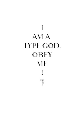
introducing us to our second typography project of the semester, titled
Font Design. Our task is to design several western alphabets. The chosen characters are a i m e p y t g o b ! . , . They explained that the process should start with a reference font that adheres to the direction we would like to head in. Subsequently, we're tasked to sketch our ideas and upon approval, we were allowed to develop the font more.
Lecture 7 | Typography in Different Mediums
Typography has evolved substantially within the past century with the introduction of computers. Now, typographers are more experimental digitally and the democratisation of technology allows for countless of typography work being produced every day. But with all that change happening to the world of typography, how does that affect the public's view of typography work? Or more importantly, how has typography changed in aspects of display? We'll be reviewing how type for print differs from the more contemporary type for screen.
Type for Print - Primarily, type was designed intended for reading from print long before the screen. IT's the designer's job to ensure that the text is smooth flowing and pleasant to read.
Type for Screen - Typefaces intended for use on the web are
optimised and often modified to enhance readability and performance on screen
in a variety of digital environments.
Hyperlink - A hyperlink is a word, phrase, or image that you can
click on to jump to a new document or a new section within the current
document.
Font size for Screen - 16-pixel text on a screen is about the same
size as text printed in a book or magazine.
Static vs Motion typography
Static typography has a minimal characteristic in expressing words. Traditional characteristics such as bold and italics offer only a fraction of the expressive potential of dynamic properties.
As for motion typography, temporary media offer typographers opportunities to "dramatise" type for letterforms to become fluid and kinetic. Motion typography is often overlaid onto music, videos,
and advertisements or set in motion with rhythm.
INSTRUCTIONS
Module Information Booklet | Typography
<iframe
height="480"src="https://drive.google.com/file/d/1XBaflX9nOKw7ogRHFAN_7-RNi-4_yu3j/preview"
width="640" ></iframe>
PROJECT 2A | FONT DESIGN
To have a better grasp of font design, we were
tasked to dissect three letters from the selected characters for this project.
I find that G, O, and H seemed to be the most interesting subjects of dissection and so forth I headed into my dissecting lab to begin operation. I
chose to dissect Janson Text LT Std in Roman Capitals because of its high contrast and handsome aesthetic.
 Fig. 1.0, G dissection
 Fig. 1.01, O dissection
Fig. 1.02, H dissection
SKETCHES
Now that I have a newfound understanding of the multitudes of
nuances present in the intricate process of designing a typeface, I began
sketching some rough ideas on the fonts I have in mind. I started off with
three designs that include contrast in strokes, serifs, sans serifs, and
different stroke techniques to test out what I think would be the most
pleasing to develop.
 Fig. 1.03, Font Sketches, 14/10/2020
I find that the second sketch seemed to be the most interesting of the three. Mr Vinod commented that the serifs needed some work but otherwise he gave the green light.
I began the developing process by sketching out the letters
individually in Photoshop rather than heading straight into Adobe
Illustrator. It was a much quicker process of visualising my ideas and looking at the characters as a whole and making sure each letter compliments each other instead of focusing on designing the vector shape of one character at a time. This was done to ensure the creation of a practical typeface that is both aesthetically pleasing and readable.
 Fig. 1.04, Font Sketches
 Fig. 1.05, Font Sketches
 Fig. 1.06, Finalised font sketches
DESIGNING
To save time and show Mr Vinod and Mr Shamsul my
idea during week 9's feedback session, I decided to image trace the
sketches in Adobe Illustrator, export the vector shapes into FontLab, and
designed the poster. I intended the poster to have the look of a Cross as
a visual pun to the phrase that was given to us for this project.
 Fig. 1.07, Designing Font in FontLab
 Fig. 1.08, Type Design first draft, 19/10/2020
 Fig. 1.09, Type Design Poster first draft, 19/10/2020
After the feedback session, I jumped straight into Adobe
Illustrator and began designing the letters one by one using the Pen Tool,
as instructed by both Mr Vinod and Mr Shamsul. Though as I got to my fourth letter, I began to feel frustrated by Illustrator's user interface because it felt unnatural for font design. So I began to rework the letters in FontLab and things moved much quicker afterwards. After many hours of figuring out the suitable thickness of the strokes, angles, and curves, I
decided to continue designing the font as a sans serif because it proved to look much better.
The name I've given this font (Dory) refers to the second mode in music: The Dorian scale. The Dorian scale can be perceived as a minor scale because it mirrors the second chord in a major scale, it can also be perceived as a reflection of the second degree to a
major scale (II). Therefore the sad and sinister sound can be seen in the sharp edges and high contrast of the font.
 Fig. 1.10, Type Design second draft, 21/10/2020
 Fig. 1.11, Type Design Poster second draft, 21/10/2020
Upon closer inspection and with the opinions of friends, some inconsistencies are noticed in the current state of the font. Particularly the strokes of G, O, and B are inconsistent, and I spent some more time trying to fix these letters. G was especially hard to design due to the varying curves of the spur and the counter.
Fig. 1.12, Reworking G
After a couple tries, the letters that needed some fixing
were fixed and the font seemed more refined and worked well
together.
 Fig. 1.13, Dory Font Final, 21/10/2020
 Fig. 1.14, Dory Font Poster Final, 21/10/2020
Fig. 1.15, Final Submission for Project 2
Font Design, 21/10/2020
FEEDBACK
Week 9
Upon review, Mr Vinod and Mr Shamsul approved of the idea of the font (refer to Fig. 1.09). However, the distortion proved to be too much for thorough feedback to be given. Mr Vinod and Mr Shamsul
instructed that I continue working on the font for final submission.
_
REFLECTION
Experience
Doing this project was super fun. All this time I thought fonts was a super tedious process of doing endless research and providing meaning behind each letter stroke. But to my surprise, my font was made purely for the aesthetic and readability and I still ended up being happy with the results. Another factor that added to this being fun is me discovering how easy it is to turn my handwriting into an actual font and use it at my own expense. Outrageous personal projects, here I come!
Observation
I noticed that above all factors that need to be put into thought when designing a typeface, readability must be prioritised. If my font can't be read, then what's the point? Another point I realised was that simplicity towers over all else in typography.
Findings
As I dive deeper into the world of Typography, I began to appreciate those
typographers who spend an immense amount of time deconstructing and
constructing typefaces for the larger body of typefaces available in the
world. It awes me more to think about those typographers who dedicate
their lives into constructing complex non-roman alphabets such as Eastern,
Southern, and Central Asian alphabets.
_
FURTHER READING
How Do I Develop A Typeface? by Peter Brugger
Type Design Process: Making Right Grotesk font in Glyphs by
Alex Slobzheninov


Comments
Post a Comment