Typography | Project 1
15/9/2020 - 6/10/2020 (Week 4 - Week 7)
Naim Zuki, (0346615)
| Bachelor of Design (Hons) in Creative Media
Typography
Project 1
LECTURES
Lecture 4 | Introduction to Type Formatting & Expression
Mr Vinod and Mr Shamsul started the lecture by
introducing us to our first typography project of the semester, titled
Text Formatting and Expression. Our task is
to express typographically the content provided in a
2-page editorial spread. No images were allowed. However, some minor graphical elements were allowed.
This exercise will predominantly be executed in Adobe
InDesign within a given size of 200x200 per pg. The use of Adobe
Illustrator was allowed to create the headline expression. Only the nine prescribed type families were allowed in this project.
Lecture 5 | Text - Part 2
Indicating Paragraphs
Pilcrow (¶) - a holdover from medieval manuscripts that is
rarely used today, but serves the purpose of indicating a paragraph.
Line Space - The contemporary, more common way of indicating paragraphs. Proper use of this would be to match the line space with the paragraph space. Eg - if line space is 12pts, then paragraph space is
12pts. This is done to ensure that cross alignment exists in the text.
Line spacing is not to be confused with leading, because Line Space is the
distance between the descender of a line to the descender of the
subsequent line; whereas leading is the space between the descender of a
line to the subsequent ascender of a line.
Indentation - Indicates paragraph by adding space between the first letter and the start of the page. Typically an indent is the same size as the line spacing or the point size of the text. Indentation should be used when the text alignment is set to justify.
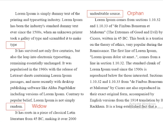
Widows & Orphans
Widow - A short line of type left alone at the end of a column
of text
Orphan - Is a short line of type left alone at the start of a
new column.

Fig. 1.02, example of Orphans and Widows that are to be avoided in any design, (Image courtesy of Vinod Nair)
There are multiple ways to highlight a segment of text in a larger body of
text, below are some examples that can achieve highlight and effectively
differentiate two bodies of text.
Italics, Bold, bold with different typeface (noted that changing typefaces require
some adjustment to the size of the typeface to match with the rest of
the text), different colours, highlighted text, typographic elements (symbols eg the asterisk, bullet points, etc), and
"quotation marks".
Headline within Text
There are multiple ways we can set headlines within typography. These different ways can be labelled as A, B, and C depending on the placement of the text in the visual hierarchy. Below are some examples that can be practised by designers.
Cross alignment is when two bodies of text
(headlines, columns, etc) are aligned with each other line by line.
Cross alignment between a header and a body text can be achieved by
setting the leading of the header as twice the leading of the body text.
By achieving this, it reinforces the architectural sense of the page
while articulating the complimentary vertical rhythm.
INSTRUCTIONS
Module Information Booklet Typography
<iframe
src="https://drive.google.com/file/d/1XBaflX9nOKw7ogRHFAN_7-RNi-4_yu3j/preview"
width="640" height="480"></iframe>
PROJECT 1 | Type Formatting & Expression
Trekking in the fields of Typography is something that not all could master so easily. Surely enough that was the case for me when I began planning this particular project. "Walking slowly through the world of typography would give you a better
understanding of the little details than rushing through and finding the
best shortcuts around." Said Mr Vinod as he explained the various steps and nuances that awaits us within this project. Thus began my incredibly slow process of comprehending what Type Formatting is.
The Type Formatting & Expression project requires us to
typographically express a given body text (with an included headline and
lead-in text) in a 2-page editorial spread. We are to utilise the knowledge
we've gained and techniques we've practised during the past several weeks to
accurately represent the texts at hand.
I've chosen the text headlined A Designer's Code of Ethics for
this Project.
Going through this article, I find that the author is passionate about creating a community of designers that are humane with their practices and responsible for their work. Therefore I wanted to express this balance and harmony between designers' ethics and their artworks by designing something that has unity.
SKETCHES
Putting readability, symmetry, and balance into consideration, I decided to choose the first sketch to be developed. I
sketched out my idea for the header in Photoshop before moving to
Adobe Illustrator to design the header for this project.
During the feedback session in week 6, Mr Vinod commented that he couldn't see a solid idea in my formatting and noted that my kerning and raging was not satisfactory. So I came back to the drawing board to see how I
could present this article more effectively. I began by scrolling through all the nine type families and experimenting with what works best as the header.
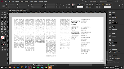
I stumbled upon Gill Sans' Light Shadowed Type Face and thought that it was the perfect typeface to be used for this project because of its modern look. I then revisited my sketch (refer to Fig. 2.02) and developed it more. To make things more interesting, I started to see if I could go with a vertical approach, I made sure that the pages were still individually 200x200.
Now when I tell you designing this took way too much time and effort, I really mean it. The number of trials and errors I've gone through to consider fitting the paragraphs and organising the header to make it comprehensible was migraine-inducing. It was at this point that it dawned on me how unfamiliar I am with InDesign. I conceded with experimenting on my own and sought out tips and tricks from external sites to see if I could work more fluidly. To my disappointment, InDesign's the reservoir of helpful videos wasn't rich enough to help me gain much knowledge, so I bitterly came back and worked night and day trying to comprehend this intricate software.
At this point, I realised how unpractical this idea was. I
was 3 cups of coffee deep and on the verge of heart failure but I pushed
on. I went back to the sketch and redesigned the Type Formatting. I dumped
the idea of a justified text and tried my hand in kerning and raging to
see if I could make something that's pleasing to the eye.
I presented this design to both Mr Shamsul and Mr Vinod and received two different feedbacks. Mr Shamsul disregarded any consideration on the design and noted that the format was not according to the Module Information Booklet saying it has to be done horizontally. I
double-checked in the MIB to see if it was stated anywhere that the design has to be horizontal and found none such fact. Mr Vinod took note of the design and commented that I have to be careful of the gutter of the page with no further comment.
Nonetheless, I complied with both comments and carried on with pitching a brand new idea. This time I head straight into InDesign without any prior sketches and such. Through the hours I've spent on the software, this design took less time. I intended the design to have a minimal approach for readability.
I sought out some feedback from my classmates to diversify my thoughts on this design and see where I could fix it up more and make it more readable. Most of them commented on the drop caps, saying their size takes away from the header and produces an unbalanced look. I edited the text accordingly with some more very minor adjustments to the kerning and raging of the header and body texts. Voila, thus my efforts have come into finalisation and presented below is my final design for this project.
Fig. 2.20, Text Formatting and Expression Sixth and Final
Draft, 07/10/2020
<iframe src="https://drive.google.com/file/d/16Emt1MUpyBdoY2iZn6cxnuPLB7lnb_iX/preview" width="640" height="480"></iframe>
<iframe src="https://drive.google.com/file/d/16Emt1MUpyBdoY2iZn6cxnuPLB7lnb_iX/preview" width="640" height="480"></iframe>
Fig. 2.22, Text Formatting and Expression Sixth and Final Draft with Grids, 07/10/2020
<iframe src="https://drive.google.com/file/d/14942WHcEAiRWjAgpZ7MPSNzinITyo-bA/preview" width="640" height="480"></iframe>
_
FEEDBACK
Week 6
Mr Vinod could not see the idea behind my work and prompted me to rework it and apply more practical ideas. He suggested I be careful of the gutter so the passage would have better readability. He also commented that my ragging and kerning was still horrendous and have not improved. Mr Shamsul warned that I haven't made my Project 1 blog and instructed me to upload as soon as possible. He complimented my work but told me to be careful of the gutter as well
Week 7
After I reworked it again with new ideas, Mr Vinod gave a more in-depth review: He noted my use of drop caps and complimented how much I've grown in typography. However, he criticised my kerning and ragging, saying forced line breaks should only be used when necessary and should not exceed 2 - 3 times in the document. Otherwise, my work was acceptable.
_
REFLECTION
Experience
Perhaps my biggest mistake going into this project was to not spend enough time learning the proper way of formatting text during the exercises. I struggled the most when trying to implement proper information hierarchy and experimented a bit too much in the process. However, all that experimenting and conceptualizing did help me become familiar with Adobe InDesign and improved my efficiency.
Observation
Throughout the process, I had to rely a lot on external sources to find how text formatting is practised in the design industry. I noticed that text formatting is mostly done with various graphical elements, so I suppose this project is an exercise for us to get used to having limited elements before giving us the freedom to use graphical elements in Advanced Typography.
Findings
This project was definitely out of my comfort zone. It took an enormous amount of time for me to learn the different techniques and rules that must be followed in order to properly execute a type formatting project. Nonetheless, I've learned a lot through the process and the key takeaway is that simplicity and readability should be put first before adding more designs to the articles.
FURTHER READING
7 Typography Rules You Need To Know by Yes I'm A Designer


Comments
Post a Comment