Lecture 2 | Development of Typography
Foreword
As unfortunate as it sounds, the media is heavily dominated by the Western World. Globalisation has made the entire world adore the culture that is least rich in anything and everything diverse and considered interesting. Curse the colonisers, I'd say. Therefore, All the information noted down in class will be from the perspective of the Western World. There just isn't enough body of knowledge out there in the media that does justice to the vast, distinct, and unique values of Eastern typography. However, that should not stop us to continue pursuing the goal of publicising our culture, giving a global platform to our mother tongue, and inspire others to continue practising our customs to ensure the survival of our culture.
Early Letterform Development: Phoenician to Roman
The Phoenician alphabet plays an important role in shaping the structure of the modern world's letterforms. From 1050BC to 150BC, the process of writing meant scratching letters into wet clay or carving them into stone with simple primitive tools. These materials and tools only allow limited dynamics in the writing, which in turn results in the letters having simple combinations of straight lines and curves. Hence, it is apparent that the modern world's uppercase letterforms are derived from the Phoenician alphabet.
Fig. 1.03, Evolution of modern Latin and early Arabic alphabets, (Image courtesy of Global 9)
As history progressed and more civilisations take place in the world, the Greeks came in with a new alphabet in the 8th century BC, aptly named The Greek Alphabet. The Greeks had a very specific way of reading their own scripts. Where Semitic people wrote from left to right, and Arabic people wrote from right to left, The Greek Alphabet is meant to be written alternately. Which meant that they wrote from left to right, then from right to left. This style is called boustrophedon (how the ox ploughs).
 Fig. 1.04, Ancient Greek boustrophedon inscription, Gortyn code, Crete, 5th century BC, (Image courtesy of Wikiwand)
 Fig. 1.05, Example of boustrophedon text, (Image courtesy of Wikiwand)
From 700BC came the Etruscan alphabet which was used by an ancient civilisation of central and northern Italy called the Etruscans. This alphabet was practised by carving the words into stone and marble. Though at the time, stone and marble were expensive and not easy to acquire (considering historic transportation, excavation, etc), so the artists and letterers painted the letters out onto the materials using brushes before chiselling it. So the different brush strokes that came in during the painting process resulted in the serifs that we know of today. This alphabet would, later on, develop into the Roman letterforms.
 Fig. 1.06 Example of chiselled Letters on marble, (Image courtesy of Roger Othornhill)
 Fig. 1.07, Development of letterforms from Phoenician to Greek to Roman
 Hand Script from 3rd - 10th Century C.E.
4th to 5th century - Square Capitals
Square capitals can be found in Roman monuments. Certain characteristics that are distinct to this letterform would be the serifs that are added to the main strokes with reed pens held at a 60-degree angle.
 Fig. 1.08, Close-up of the Lyon Tablet, (Image courtesy of Wikiwand)
Late 3rd century to mid 4th century - Rustic Capitals
Rustic capitals is a compressed version of Square Capitals with the exception of the reed pen being held at a 30-degree angle instead of at a 60-degree angle. Rustic capitals allowed for twice as many words on a sheet of parchment paper and took far less time to write, which proved to be essential for letterers when writing a long piece of script on a limited amount of space.
 Fig. 1.09, Folio14 recto of the Vergilius Romanus contains an author portrait of Virgil, (Image courtesy of Wikipedia)
4th century - Roman Cursive
Although Square and Rustic capitals were wildly used for documents or official papers, everyday transactions by the public were written by hand. This hand-writing was done in simplified and rushed forms that made it possible for them to work more efficiently. Hence this is where we can see the lowercase letterforms being developed.
 Fig. 1.10, old roman cursive handwriting from the reign of Claudius, (Image courtesy of Avitus
4th - 5h Century - Uncial Further development of Roman Cursive would be Uncials. Some aspects of Roman cursive that is adapted in Uncials exists in the shape of the letters A, D, E, H, M, U, and Q. The word UnciaI is Latin for a twelfth of anything. Which some scholars think it means that the letters are one inch, though it would be more accurate to consider uncials as one of the first renditions of small letters.
 Fig. 1.11, Uncial Alphabet Calligraphy, (Image courtesy of Evelyn Grace Marinoski)
C. 500 - Half-Uncial
The introduction of Half-Uncials marks the formal introduction of lowercase letterforms complete with ascenders and descenders, 2000 years after the Phoenician Alphabet was first developed.
 Fig. 1.12, Half-Uncial excerpt from Handbook of Greek and Latin Paleography, (Image courtesy of Thompson)
C. 925 - Caloline Miniscule
In 789 A.D., the first unifier of Europe since the Romans, Charlemagne, issued an edict to standardise all ecclesiastical texts. Among this task to Alcuin of York, Abbot of St. Martin of Tours, who instructed the monks to rewrote the texts using both majuscules (uppercase), minuscule, capitalisation and punctuation. Alcuin of York succeeded in his mission and thus the standard for calligraphy was set for a century.
 Fig. 1.13, Caloline Miniscule
Blackletter to Gutenberg's Type
C. 1300 - Blackletter (Textura)
With the dissolution of the Charlemagne's Empire came the regional variations of Alcuin's script, where a condense strongly vertical letterform known as Blackletter/Textura exists in Northern Europe, a rounder more open-handed letterform known as Rotunda exists in the south.
C. 1455 - 42 line bible. Johannes Gutenberg, Mainz
The inventor of the mechanical movable type printing press: Johannes Gutenberg's influence in the publication of the 42-line bible resulted in the increased accessibility of written text being produced on a larger scale within the western civilisation.
Further Timeline
Humanist Script to Roman Type
- C. 1460: Lucius Lactantius, Venice
- 1472: Cardinal Johannes Bessarion, Conrad Sweynheym, and Arnold Pannart, Subiaco press, Rome
- 1471: Quintillian, Nicholas Jenson, Venice
Venetian Type from 1500
- 1499: Colona, by Francesco Griffo
- 1515: Lucretius, type by Francensco Griffo
Golden Age of French Printing
- 1531: Illustrissimae Galliaru reginae Helianorae, printed by ROver Estienne, Paris. Type Cast by Claude Garamond
Dutch Printing
- 1572: Polygot Bible (Preface). Printed by Christophe Plantin, Antwerp
English type from the Eighteen Century
- 1734: William Caslon. Type speficmen sheet, London
Basketville's innovations
- 1761: William Congreve, typeset and printed by John Baskerville, Birmingham
- 1818: Giambastitsta Bodoni: Manuale Tipografico, Parma
Type Text Classifications
-1450 - Blackletter
Earliest printing type. Based upon the hand copying styles in northern Europe.
-1475 - Oldstyle
Based upon lowercase forms used by Italian humanist scholars for book copying and uppercase letterforms found inscribed on Roman ruins.
-1500 - Italic
Contemporary Italian handwriting, condensed and close-set. Originally considered their own class of type, italics were soon cast to complement roman forms and thus all typefaces have been designed with accompanying italics.
-1550 Script
Widely used in shorter applications rather than lengthy ones.
-1750 Transitional
Refined Oldstyle forms.
-1775 Modern
Represents a further rationalisation of Oldstyle letterforms.
-1825 Square Serif / Slab Serif
Originally heavily bracketed serif, these faces emerged during the newly developed needs of advertising for heavy type in commercial printing.
-1900 Sans Serif
As the name suggests, this letterform contains no serifs. Originally developed in 1816 by William Caslon IV, its use did not become popular until the beginning of the twentieth century.
-1990 Serif / Sans Serif
Can be referred to as semi-sans or semi-serifs, where the letterforms scur the boundaries of serif and sans serif. Often time includes both serif and sans serif.
_
Lecture 3 | Basic Typography
Let's get down straight to the cake and start with some essential terminologies.
Baseline - The imaginary line at the visual base of the letterforms.
Median - The imaginary line defining the x-height of letterforms.
x-height - The height in any typeface of the lowercase 'x'.
Apex / Vertex - The point created by joining two diagonal stems (apex - above; vertex - below).
Arm - Short stokes off the stem of the letterform, either horizontal (E, F, L) or inclined upwards (K, Y).
Ascender - The portion of the stem of a lowercase letterform that projects above the median.
Barb - The half-serif finish on some curved stroke
Beak - The half-serif finish on some horizontal arms
Bowl - The rounded form that describes the counter. The bowl may or may not be either open or closed.
Bracket - The transition between the serif and the stem.
Cross Stroke - The horizontal stroke in a letterform that joins two stems together.
Crotch - The interior space where two strokes meet
Ear - The stroke extending out from the main stem or body of the letterform
Em / En - Originally referring to the width of an uppercase M, an em is the distance equal to the size of the typeface (eg: em in 48 points). An en is half the size of an em. Most often used to describe em/en spaces and em/en dashes.
Finial - The rounded non-serif terminal to a stroke
Ligature - The character formed by the combination of two or more letterforms
Serif - The right-angled or oblique foot at the end of the stroke
Spine - The curved stem of the S
Stress - The orientation of the letterform, indicated by the thin stroke in round forms
Swash - The flourish that extends the stroke of the letterform
Terminal - The self-contained finish of a stroke without a serif. This is something of a catch-all term. Terminals may be flat ('T' above), flared, acute ('t' above), grave concave, convex, or rounded as a ball or a teardrop.
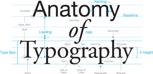
Fig. 1.14, Anatomy of Typography
Uppercase - Capitals letters, including certain accented vowels, the c cedilla and n tilde, and the a/e and o/e ligatures
Lowercase - Lowercase letters include the same characters as uppercase.
Small Capitals - Uppercase letterforms draw to the x-height of the typeface. Small Caps are primarily found in serif fonts as part of what is often called expert set.
Uppercase Numerals - Also called lining figures, these numerals are the same height as uppercase letters and are all set to the same height as uppercase letters and are all set tot he same kerning width. Commonly used with Uppercase Letters.
Lowercase Numerals - Also known as old style figures or text figures, these numerals are set to x-heights with ascenders and descenders. They are best used whenever you would use upper and lower case letterforms.
Italic - The forms in an italic refers back to fifteenth-century Italian cursive handwriting.
Punctuation & Miscellaneous Charatecters - though most typefaces contain standard punctuation marks, miscellaneous characters can change from typeface to typeface.
Ornaments - Used as flourishes in invitations or certificates.
_
Lecture 4 | Text - Part 1
Kerning - The automatic adjustment of space between letters.
Letterspacing - Adding space between the letters.
Tracking - Addition or removal of space in a word or sentence.
Counterform - blank spaces between individual letters.
The main purpose of kerning, letterspacing, tracking is to improve the legibility and readability of the text while maintaining a visually pleasing output. It is mostly used when working with headlines, where uppercase letters are the main components in the text. Lowercase letters usually require the counterform to maintain readability, so any letterspacing is discouraged.
 Fig. 1.15, Tracking and Kerning examples, (Image courtesy of Adobe)
 Fig. 1.16, Example of tracking, (Image courtesy of Adobe)
Flush Left - A format that closely mirrors the asymmetrical look of handwriting. Each line starts at the same point but ends wherever the last word on the line ends. Spaces between words are consisted throughout the text, allowing the type to create an even grey value.
Centred - A format that imposes symmetry upon the text, assigning equal value and weight to both ends of any line.
Flush Right - A format that places emphasis on the right end of a line as opposed to the left, the opposite of flush left. It can be useful in situations where the relationship between the text and image might be ambiguous without a strong orientation to the right.
Justified - A format that imposes symmetrical shape on the text. It is achieved by expanding or reducing spaces between words and letters. The resulting openness of lines can be occasionally produced rivers of white space running vertically through the text.
In type formatting, designing an expressive format come at the price of readability. We as designers have to strive to find the necessary balance between aesthetics and functionality. Serving justice to the author is our first job, everything else comes second.
Texture
With the range of typefaces that are available today, designers need to take into account how these typefaces function in certain situations. Some are appropriate for long body of texts, some are only appropriate for headlines. Type with a relatively generous x-height or relatively heavy stroke width produces a darker mass on the page than type with a smaller x-height or lighter stroke. The differences in x-height and the mass affect how the readability of the body of texts. These nuances are called textures.
The different typefaces that would be used throughout this module are - Adobe Caslon, Basketville, Bembo, Adobe Garamond Pro, Bauer Bodoni, Adobe Jenson Pro, Bauer Bodoni, Univers, Futura, Gill Sans.
Leading & Line Length
The goal of setting text type is to allow for easy, prolonged reading. At the same time, a field of type should occupy the page as much as any photograph does.
Type - Text type should be large enough to be read easily at arm's length.
Leading - Text that is set too tightly encourages vertical eye movement: A reader can easily lose his or her place. Type that is set too loosely creates a striped pattern that distracts the reader from the material at hand.
Line Length - Shorter lines require less leading; longer lines require more. A good rule of thumb is to keep line length between 55 - 56 characters.
Type Specimen Book
A type specimen may be understood to mean an orderly and preferably complete conspectus of the typefaces available in a particular type foundry or printing house, offering a choice of types for viewing in one case and for use in the other. It may be a single sheet or a book.
 Fig. 1.17, Type Specimens by Neon Type Division of Typefounders Chicago, (Image courtesy of Dr. David MacMillan)
_
Lecture 5 | Text - Part 2
Indicating Paragraphs
Pilcrow (¶) - a holdover from medieval manuscripts that is rarely used today, but serves the purpose of indicating a paragraph.
Line Space - The contemporary, more common way of indicating paragraphs. Proper use of this would be to match the line space with the paragraph space. Eg - if line space is 12pts, then paragraph space is 12pts. This is done to ensure that cross alignment exists in the text. Line spacing is not to be confused with leading, because Line Space is the distance between the descender of a line to the descender of the subsequent line; whereas leading is the space between the descender of a line to the subsequent ascender of a line.
 Fig. 1.18, difference between line space and leading, (Image courtesy of Vinod Nair)
Indentation - Indicates paragraph by adding space between the first letter and the start of the page. Typically an indent is the same size as the line spacing or the point size of the text. Indentation should be used when the text alignment is set to justify.
Widows & Orphans
Widow - A short line of type left alone at the end of a column of text
Orphan - Is a short line of type left alone at the start of a new column.
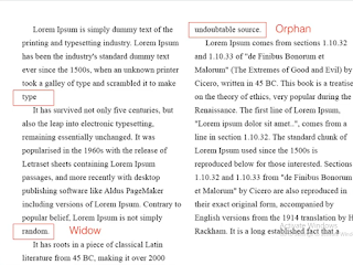 Fig. 1.19, example of Orphans and Widows that are to be avoided in any design, (Image courtesy of Vinod Nair)
Highlighting TextThere are multiple ways to highlight a segment of text in a larger body of text, below are some examples that can achieve highlight and effectively differentiate two bodies of text.
Headline within Text
There are multiple ways we can set headlines within typography. These different ways can be labelled as A, B, and C depending on the placement of the text in the visual hierarchy. Below are some examples that can be practised by designers.
 Fig. 1.20, A Headers
 Fig. 1.21, B Headers
 Fig. 1.22, C Headers
Cross Alignment
Cross alignment is when two bodies of text (headlines, columns, etc) are aligned with each other line by line. Cross alignment between a header and a body text can be achieved by setting the leading of the header as twice the leading of the body text. By achieving this, it reinforcces the architectural sense of the page while articulating the complimentary vertical rhythm.
 Fig. 1.23, Example of Cross Alignment
_
Lecture 6 | Understanding Letters
Letters
Much like any other great pieces of artwork, details and nuances play a vital role in creating a type that would stand out in the sea of typefaces. Take symmetry for example, have you ever placed certain letters of a specific typeface on a grid and measured it's lengths and widths before? If we place a grid over Baskerville's letter A, we can note that there is actually no symmetry present in the typeface. The same applies to Univers.
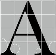
 Fig. 1.24, Note that the left stroke is thicker than the right in both examples, (Image courtesy of Vinod Nair)
The details of any letters in any given typefaces can be reviewed and examined over and over again, and the subtle differences would always be present. These distinctions are what needs to be taken into careful consideration when creating a typeface; it reflects both the elegance of the type as well as the time, thought, and effort put into designing the type by the typographer.
Maintaining x-height
More subtle details that exist in typography is how curved strokes must rise above the median line to optically maintain the same text size as the rest of the type.
 Fig. 1.25, Notice how the curved strokes go over the median lines, (Image courtesy of Vinod Nair)
Counterforms
Counterforms are taken into account when designing types to ensure that the readability is maximised. Otherwise, it can also be manipulated to improve the aesthetic of the letterform.
Contrast
When dealing with different sets of information, typographers often uses contrast to separate the differences so it becomes more apparent to the reader. Below are some examples of contrast: -
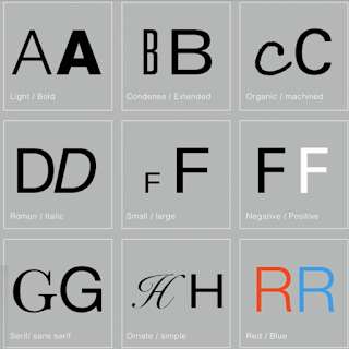
Fig. 1.26, Examples of Contrast, (Image courtesy of Vinod Nair) _
Lecture 7 | Screen & Print
Typography has evolved substantially within the past century with the introduction of computers. Now, typographers are more experimental digitally and the democratisation of technology allows for countless of typography work being produced every day. But with all that change happening to the world of typography, how does that affect the public's view of typography work? Or more importantly, how has typography changed in aspects of display? We'll be reviewing how type for print differs from the more contemporary type for screen.
Type for Print - Primarily, type was designed intended for reading from print long before the screen. IT's the designer's job to ensure that the text is smooth flowing and pleasant to read.
Type for Screen - Typefaces intended for use on the web are optimised and often modified to enhance readability and performance on screen in a variety of digital environments.
Hyperlink - A hyperlink is a word, phrase, or image that you can click on to jump to a new document or a new section within the current document.
Font size for Screen - 16-pixel text on a screen is about the same size as text printed in a book or magazine.
Static vs Motion typography
Static typography has a minimal characteristic in expressing words. Traditional characteristics such as bold and italics offer only a fraction of the expressive potential of dynamic properties.
As for motion typography, temporary media offers typographers opportunities to "dramatise" type for letterforms to become fluid and kinetic. Motion typography is often overlaid onto music, videos, and advertisements or set in motion with rhythm.
_
INSTRUCTIONS
Module Information Booklet: Typography
<iframe src="https://drive.google.com/file/d/1XBaflX9nOKw7ogRHFAN_7-RNi-4_yu3j/preview" width="640" height="480"></iframe>
Exercise 1 | Type Expression
Part 1
Predominantly using Adobe Illustrator, we were tasked
to choose 4 words to compose and express using a set of typefaces. The
goal of this exercise is to mould the words chosen in such a manner
that allows the meaning of the word to become visible to the
audience.
The 4 words I've chosen are Mad, Tired, Bang, and Scary.
Now if you know me, you know I love working within an emotional theme and coming up with something that can be understood as a whole. Hence for these selections of words I've tried my best to incorporate emotions within the designs. The following are my inspiration and sketches for idea generation.
 Fig. 2.01, when I think of Mad, of course, Joker came into mind
and it's a must, (Image Courtesy of R4ND0MZ)
 Fig. 2.02, tiredness and coffee go hand in hand;
the above is also an accurate representation of how much coffee I
drink within a week, (Image courtesy of Alice Park)
 Fig. 2.03, Mad and Tired Sketch
 Fig. 2.04, Bang and Scary sketch
Below are my interpretations and experiments of
Tired and Scary.
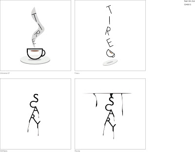
Fig. 2.05, Tired and Scary drafts
At this point, I began to question my creativity for the last two words and wondered if I have enough ideas for me to
design them. Alas after hours of considering,
Bang became the victim of
an artist's creativity exhaustion syndrome and thus thrown aside.
Lo and behold, came
Breathe into the
picture. After designing my type expression for Breathe, I designed the type expression for Mad using Joker's smile as inspiration.
Below are the final designs on this
exercise.
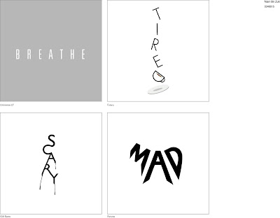 Fig. 2.06, Final Type Expression Designs, 15/9/2020
Interpretations
I've designed Breathe to be minimalistic because it insinuates calmness when
doing proper breathing techniques. The
white typeface represents breathing in and the grey background
represents breathing out, to show how I would take my time
breathing out because it slows my heart rate faster than
breathing in.
Tired took the most time and effort in designing because of that small cup of coffee. Based on my sketch, you would already assume that I'm a caffeine addict when a
cup of steaming hot coffee was my immediate thought when thinking about the word Tired. Rightfully so, I am shamelessly a
caffeine addict. The falling motion would, of course, be related to how I always fall right to sleep whenever and wherever I'm overrun by extreme fatigue.
Scary was fun
to design due to it's simple yet, in my opinion,
effective visualisation. The dripping blood effect is a classic. The connection between the words is done to show that the
word Scary might have been carved into human skin with
fresh blood coming out of the wound. I wrote this at 3 am,
forgetting that I am horribly terrified of ghosts.
Mad had the
most experimental sketches out of all four selections and I had the
most fun visualising. I intended to shape the word into a distorted
smile, possibly with a little stream of saliva oozing on the side.
Though, I quickly learned that distorting the words was strictly
prohibited, so I used the Ellipse Tool and the Text On
Path tool to create the curved typeface. I used the Pen Tool to extend the shapes of the letters to resemble a
somewhat distorted smile. Did I do Joker good? I sure hope so.
Part 2
For this part of the exercise, we were tasked to
choose one out of the four words and turn it into a gif.
I've chosen
Scary as my muse to
encapsulate my interpretation of the word. I've composed 32 frames
for the gif and transported the artboards into Photoshop for final
adjustments and rendering of the gif.
 Fig. 2.07, Finalising in Photoshop
 Fig. 2.08, Finalised Scary Gif, 15/9/2020
_
Exercise 2 | Type Formatting
For this week's exercise, Mr. Vinod and Mr. Shamsul introduced us to Adobe InDesign. I was a little overwhelmed at how technical the User Interface of this software is and how tedious the process of this exercise would be. It first looks like Adobe Illustrator had an overdose of steroids.
The exercise started with a making Business Card. The lectureres showed the steps in class on how to construct them from the formatting of the canvas to choosing appropriate fonts to arranging the information on the card to establish hierarchy. Below is my progress for this exercise and final submission.
Business Card Exercise
 Fig. 2.09, Business Card Progression, 22/9/2020
 Fig. 2.10, Business Card Final, Pg. 1, 22/9/2020
Fig. 2.11, Business Card Final; Pg. 2, 22/9/2020
Afterwards, we're tasked to chose any essay that we've written in the past and practise a little Type Formatting.
 Fig. 2.12, Business Card Final; Pg. 3, 22/9/2020
Fig. 2.13, Text Formatting Exercise 1 Final; Business Card,
22/9/2020
<iframe
src="https://drive.google.com/file/d/1mSxSjt3CfDcLMHhNkYCSMMANHohbk_c-/preview"
width="640" height="480"></iframe>
Type Formatting Exercise
After that exercise, we're tasked to use an article chosen by the lecturers for a Type Formatting exercise. In this exercise, we're told to pay attention to the margins, columns, point size, line length, leading, paragraph spacing, layout, and cross alignment. Below are my progress and final submission for this exercise.
 Fig. 2.10, Text Formatting Progress, 22/9/2020
 Fig. 2.11, Text Formatting Progress, 22/9/2020
 Fig. 2.12, Text Formatting Progress; Details, 22/9/2020
 Fig. 2.13, Text Formatting Exercise Progression; Pg. 1, 22/9/2020
Fig. 2.13, Text Formatting Progression; Pg. 2, 22/9/2020
 Fig. 2.14, Text Formatting Exercise 2 Progression, 22/9/2020
 Fig. 2.15, Text Formatting Exercise 2 Progression, 22/9/2020
Fig. 2.16, Text Formatting First Draft
_
FEEDBACK
Week 1 - Week 2
I was still new to the programme, so the lecturers excused me from work submissions.
Week 3
Mr. Vinod notes that the animation was smooth and it represented the word chosen accurately. The only comment he has was the heavy use of non objective elements within the gif. Though he note that the animation was still borderline acceptable.
Week 5
For the business card exercise, he noted everything I did was done properly with the exception of my link, he said to replace my wixsite link to my blogspot link. The passage exercises however, he noted that my kerning and ragging was done horribly and urged me to review the lectures and do better.




Comments
Post a Comment