Digital Photography & Imaging | Exercises
23/8/2020 - present (Week 1 - present)
The steps I took to edit this picture of me into the pool room was almost identical to how I edited Shazam into the pool room. The only addition I made was adding a slight distortion to my image to fit in with the perspective of the camera. My picture was taken from a front angle which contradicts the perspective of the pool room, hence slight adjustment according to the perspective lines of the room has to be made.
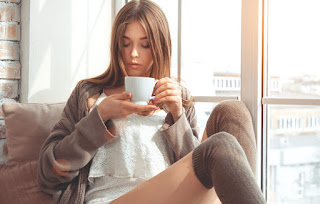
Fig. 1.11, Girl with coffee
Just kidding. I hope jokes are allowed here.
Much like the demonstration in class, after choosing the reference pictures from the internet, I chose appropriate colours for the skin, hair, sweater, lips, eyes, eyebrows, and background colours. I used various selections tools along with the lasso tools with the refine edge tool to crop out different parts of the image. After that, I did some post-editing in Lightroom where I played around with colour grading to make the composition look more interesting.
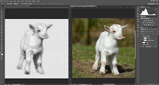
Fig. 1.51, progress in Photoshop; (right, making displacement file; left, applying displacement map)
Exercise 5 | Parallax Effect (Extra Class)
Upon closer inspection, this composition makes no sense. So I tried to apply more ideas into it.
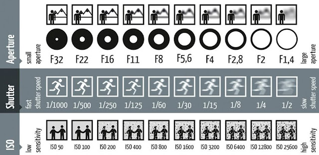
Fig. 2.21, Brief Examples of Varying Shutter Speed, Aperture, and ISO Sensitivity Values, (Image courtesy of Daniel Peters)
Naim Zuki, (0346615) |
Bachelor of Design (Hons) in Creative Media
Digital Photography and Imaging
Exercises
Writer's Note
For the sake of simplicity, I'll be dividing this blog into two parts according to the lectures and exercises given by Mr. Martin and Mr. Fauzi. In the Lectures session, you'll find all the notes and works I've done for Mr. Martin's class. While under the Instructions section, you'll find all my notes and work I've done for Mr. Fauzi's class.
LECTURES | Mr. Martin
Exercise 1 | Hearst Mansion
Demonstration
In this exercise, Mr Martin introduced us to our first Photoshop assignment of the school year! How exciting it is to finally be able to
click on the PS icon on my computer for an academic purpose. Putting my
brain and fingers into scholastic practice, I'd say.
This exercise was predominantly focused on Photoshop's selection tools and image adjustment tools. The main ones that I've used within this exercise were the Quick Selection
Tool and the Polygonal Lasso tool, which, in most cases, is a match made in heaven for fluent selection of subjects within an image.
Mr. Martin explained that a fundamental rule of manipulating an image is matching the edited pictures' colours to match each other. The following is my take on the task based on the example given in class.
To apply the cutout of Shazam from the poster into the Hearst Mansion image and make it look convincing, I matched the colours coming off of Shazam's suit with the hue of the interior of the Mansion. Notice that Shazam has more of a warmer tone compared to the cool tone of the blue walls within the room. By matching the colours together, we could incorporate these two images together and create somewhat of a satisfactory edit.
Conversely, ignoring the idea of light
reflection, hues, tones, and temperature when editing an image would create
a composition that looks out of place and unattractive.
Exercise
For this part, I thought of choosing a fitting image of me that would make it look like I'm enjoying my time within the pool room.
_
Exercise 1.5 | Paths, Masking, and Layering
Thus as our journey into the world of Photoshop continues, we were introduced to the wondrous Blending Mode tool within photoshop. Practical use of the module that will be shown below involves applying vignetting within an image, mixing two different pictures together, and creating a low contrast image.
Applying vignetting in Photoshop
The vignetting effect can be achieved by applying a gradient over an image. The following is a quick run-down on achieving the effect on the Hearst Mansion exercise.
Fig. 1.08, Shazam within the Hearst Mansion
Blending two images together
The second part of this exercise is comprised of blending two images together using the Screen blending mode. The first practice is to add steam onto a cup of coffee.

Fig. 1.11, Girl with coffee
The second practice is to add birds into a picture
of a sunset.
The third practice is adding a low contrast image.
_
Exercise 2 | Cowboy Exercise
Demonstration
With the knowledge gained in the last couple of weeks, Mr. Martin kicked the difficulty up a notch by challenging us with another photo-manipulation edit. This time he focuses more on the details of our work to test our Photoshop Skills. He showed the class a demonstration with the following set of pictures and had us follow after.
The task is to edit these three images together into one singular image of a haunted house in a gloomy atmosphere.
In this edit, the house is cropped out from the original picture using the Lasso Tool, the Polygonal Lasso Tool, and refined using the Refine Edge tool. It was a bit tricky trying to get the leaves into the frame naturally, so I put extra emphasis on the feathering of the leaves. I applied the Screen blending mode on the Ghost Lady to quickly remove the black background and fit it into the house. I tried placing the house on multiple areas of the frame to see which would fit in best. Below is where I personally preferred the house to be.
Just kidding. I hope jokes are allowed here.
If you look closely, I've done some editing on the exposure and some colour grading on this picture to make it blend better. I've put some extra work on the different levels of exposure on every single element in this edit, particularly the old house itself. Below is a closer look at where I placed these adjustment layers.
Exercise
We're then tasked to carry out the same exercise using the following three images.
This time around, the goal is to make the pictures seem like a photograph taken in the wild west.
Just like before, I started by cropping out the house using the Lasso Tool, the Polygonal Lasso Tool, and refined using the Refine Edge tool. But what's different is how much harder it is to cut out the cowboy from the background, I used more of the Lasso tool to focus on the ropes around his waist.
Upon review by Mr. Martin, he said the cutout work was satisfactory but it was over-exposed and the colour blending was a little off. So I head off onto Photoshop to do some more colour grading. I varied the exposure, tone curve, as well as played around with the saturation throughout the layers to emulate the look of dusk. Though as I was experimenting with the colours, I realised that I wanted to style the image into an aged photograph look, so I reduced the saturation and turned up the temperature.
_
Exercise 3 | Recolouring Exercise
Demonstration
For this week's class, we're tasked to recolour black and white images entirely using Photoshop. Hearing about this exercise, I almost peed my pants in dread. I had only heard and seen professional recolouring work and I wouldn't know if I could successfully execute this exercise. But nonetheless, I tried my best.
Mr. Martin used the following pictures for his demonstration. His technique involved using pictures gathered from the internet as colour references to add to the black and white picture.
With the references gathered, I started by choosing appropriate values for the skin tone, hair, coat, lips, eyes, and eyebrows. Afterwards, I used different selection tools and lasso tools to cut out different parts of the image according to the colours that would be applied. Using layer masks, I started applying the colours on the separate cutouts and experimented with different blending modes to see which would look best in blending the colours together.
Exercise
For the exercise, we were given a set of black and white images to choose from, I've decided to choose the following images to experiment.
I started with the first picture (Fig. 2.34), mainly because Mr. Martin challenged the class with it and I thought I could challenge my photoshop skills and see how far I can go with it.
I tried to experiment with different skin tones, hair colours, and eye colours to see which one would fit this picture well. Though to my disappointment, most of them didn't fit well with this woman and I chose to stick with this hair colour with this skin tone.
At this point, I've come to accept that mayhaps this image was a bit out of my level and I should try to recolour other images that is more within my range of expertise. So I tried with the next image (refer to Fig. 2.35).
Fig. 1.44, Progression in Photoshop, with included reference pictures
Much like the demonstration in class, after choosing the reference pictures from the internet, I chose appropriate colours for the skin, hair, sweater, lips, eyes, eyebrows, and background colours. I used various selections tools along with the lasso tools with the refine edge tool to crop out different parts of the image. After that, I did some post-editing in Lightroom where I played around with colour grading to make the composition look more interesting.
_
Exercise 4 | Hybrid Animal Exercise
Exercise
For this exercise, we were given the freedom to choose whatever animal and whichever pattern to add over them. After a few searches on Google Images, cracking my head in two while trying to think of good combinations, I came to the wonderful conclusion to go with an animal with white fur because it provides a simpler editing process.

Fig. 1.51, progress in Photoshop; (right, making displacement file; left, applying displacement map)
I first tried out editing the Giraffe Fur to see if I could get something going and create a sheepxgiraffe action going.
So I moved on to the snow leopard fur and it turned out way better.
_
INSTRUCTIONS | MR FAUZI
Module Information Booklet: Digital Photography and Imaging
<iframe
src="https://drive.google.com/file/d/107_21Lf4ir6kvUey33eS6EsPN2kocuFe/preview"
width="640" height="480"></iframe>
Lecture 1 | Introduction
To kick start the module, Mr Fauzi introduced us to the concept of composition that lies within digital editing. He explained how an artwork could be arranged with a set focal point and visual hierarchy to manipulate visual feedback from the audience.
Furthermore, Mr Fauzi stresses the importance of self-discovery within this module to enhance the style that the students would develop within the next fourteen weeks. He explained how the outcome of our work should reflect our own perspective on the world and how we would want to choose to express ourselves.
_
Task 1 | Reviewing Photoshop Examples
We're given the task to choose three photoshop works that
we find most attractive and provide a short rundown of what we find
attractive.
I've recently discovered viktorhstudios and I love their
work so much that I just had to include these two edits. The overall
ambiguity of their work adds such a level of depth into the interpretation
that it excites me every time they release new works. Another touch that they
incorporate in their work that I adore is the noisy and slightly desaturated look of film prints.
The Japan-based photographer Liam Wong is best known for
his work in capturing street photography in east Asian cities. When it comes to experimenting
with the endless possibilities of visual editing, his work always awes me,
such as shown above in fig. 2.3. The thing that strikes me the most in his work is how he expresses colours within specific scenes. Take this, for
example, the blue overall acts as a cooling effect that compliments the
intense red that bounce off of the model's face and the lights in the buildings, subconsciously guiding the viewer into her gaze.
Drue is a rising artist that experiments mostly in photography.
However in
this
particular photoshoot he experiments with how bright colours can bring out
particular subjects within a composition. Apart from the output, the way he
shows his working process inspires me to experiment more with different
techniques and ideas.
_
Task 2 | Paths, Masking, and Layering
After being introduced to the difference in Blending Modes, we're
instructed to compose a collage with the given set of images.
Starting this task, I took some time trying to comprehend what Blending Mode is and how it is applied with different techniques. Though, my exploration went only as far as applying them amateurishly to create a surrealistic look.
Unfortunately, the only idea I had in mind was to make this look like an old married couple looking for a factory on sale in a secluded mountain. The following compositions went basically the same.
_
Task 3 | Match Lighting, Adjustment Layers, Filters
This week's class is comprised of the same exercise as the previous week but with a tad bit more complexity. The expected outcome was to include varying manipulation of colours, utilising adjustment layers (ie. exposure, levels, tone curve), and filters to create a more dramatic composition. The following are the pictures provided for this task.
IDEA EXPLORATION
This time around, I did a proper idea and inspiration exploration before starting the design. From last week's feedback I got from Mr. Fauzi, he noted that what lacked in my compositions are ideas that can be communicated well and are relatable with the audience. Hence, below are what I've gathered to be my main inspirations.
COMPOSITIONS
With the heavy use of The Rule of Thirds, I first went with my first compositions with a lot in mind. I tried to create a plane to provide a sense of space in the composition. Then as I was brainstorming my next addition, I recalled an important composition concept that I learned while exploring photography years ago: Subjects. That was what lacked in my previous collages: A subject to tell a story. Thus, I focused on creating a subject for this collage. Once satisfied, I played around with the Tone Curves adjustments to create a pinkish colour tone.
Feeling happy with this composition, I decided to approach it in the same way for my next collage. I decided to make the astronaut as my subject and create a more straight-forward idea of a man reaching out from a portal.
In this composition, aside from using the Rule of Thirds, I've applied the concept of guiding lines by using the building and the coloured moon to guide the viewer's gaze into the main subject. I've also decided to explore the vintage film style by adding some noise layers to make it look flatter and give it that classic noisy desaturated look that films are famously known for.
Now that I've made two compositions subject-centred, I decided to go off theme and make a landscape-Esque collage as a small fun challenge. I warped the mountains to look like a landscape and added Shanghai as a little contrast to the natural mountains. Then, of course, to make it look surreal, I made some moons/planet thingy with the topography picture and a solid colour circle with a gradient overlay.
_
Task 4 | Exposure, Aperture, Shutter Speed, and ISO Study
Photography is traditionally the act of capturing light onto a piece of photosensitive paper. Before the digital age, photography was done in a long and tedious process, from setting up the camera before holding the shutter open for a good 30 seconds until all light is imprinted on the paper to post-processing the films in a dark room with specific combinations of chemicals to properly balance out the colours of the photograph. By understanding this process, we can properly derive what exposure, aperture, shutter speed, and ISO are.
Exposure, in simple terms, is how much light is being exposed to the roll of film. The bigger the exposure, the more light that comes in, the brighter the picture. In contrast, the smaller the exposure, the less light that comes in, the darker the picture. An improper balance of exposure would create an effect that is known as Overexposure and Underexposure. Both of these effects follow the same concept, the more overexposed or underexposed parts of a photograph are, the fewer details would be present in the photograph.
Shutter Speed is the time the shutter is open and exposed to light. The longer the shutter opens, the more light comes in; thus, the shorter the shutter opens, the less light comes in. Aside from using this concept to manipulate the exposure, shutter speed can be used to capture motion in different ways. When the shutter speed is fast, motion can be frozen and a crips picture will be taken. Conversely, when the shutter speed is slow, motion can be taken with a blurred effect.
Aperture is the opening of the lens that controls the amount of light that enters the film/photosensor. The aperture affects the focal length of an optical system.
ISO sensitivity is a measure of the camera's ability to capture light. The lower the ISO value, the less sensitive the camera or film is towards light. Though, the price of increasing the ISO value comes in the presence of noise; the higher the ISO value, the more sensitive the film is to light and the more noise is present in the photograph. Although, ISO can be manipulated to change the behaviour of the shutter speed to reduce camera blur.

Fig. 2.21, Brief Examples of Varying Shutter Speed, Aperture, and ISO Sensitivity Values, (Image courtesy of Daniel Peters)
_
FEEDBACK
Week 2
Mr. Martin questioned the picture I used for the Hearst Mansion and gave it a suspicious look, but otherwise, he approved of the edit.
For the collage work, Mr. Fauzi said the first composition is the best. He commented that the others don't have a solid idea and don't communicate well with the audience. He suggested that I keep my collages simple and clean.
Week 3
Mr. Martin said that the cutout of the house and the cowboy are clean. His main comment was that the picture is overexposed and noted that some details are lost in the sky. Following up to that, he said that the colours between the sky and the house don't blend well together.
Mr. Fauzi complimented all the collages made this week. He approves of the composition and the technicalities of the collages and had no further comment.
Week 4
Mr. Martin said my work was okay.
Week 5
For the hybrid animal exercise, Mr. Martin said that some parts of the lamb look overexposed and that a bit of touchup on the pattern needs to be done. After some editing, he approves of the work.
_
REFLECTION
Week 1
I enrolled in the programme late so I didn't manage to attend the first class of the semester. Though from the recorded lecture, Mr. Martin and Mr. Fauzi were helpful in guiding the students in the process of creating the e-blog and explaining to us how this module will be conducted.
I was a bit overwhelmed with the upcoming exercises and projects but nonetheless, I was hopeful and the lecturers would be helpful throughout the semester.
Week 2
I've been learning and using Photoshop for freelance poster work for about a year now and I've only managed to get so far with what I've learned on Youtube. So it felt really relieving that I have a proper educator guiding me on how to use the different tools that I didn't know of prior to entering the university. Mr. Martin definitely impressed me in class when he was demonstrating the Hearst Mansion exercise. I felt like I definitely went overboard with the perspective adjustment but I guess I wanted to just try different things out. A couple of classmates said that the picture I used was funny and that made me happy.
Week 3
Exercise 1.5 is more of an image editing exercise that I expected to be done on Lightroom and I didn't really see a point doing it in Photoshop. But I tried it anyway. Aside from blending the two images together, I compared my edit on Photoshop with what I could do in darktable because I was more accustomed to darktable when it comes to photo editing. Though I later realised that by doing this exercise, I'm more aware of the different blending modes and adjustment layers that are available in Photoshop that could help me with the photo-manipulation projects that would come.
Exercise 2 was fun, to say the least. It was a straight forward exercise that was interesting and educational. The fun part was when I realised that I want to spice up my blog by making a small joke while I was biting my nails at the amount of unfinished work I have three weeks into the semester. I find that the part I enjoy most in editing images in Photoshop is the photo-adjustment process that comes at the end of every exercise. I have no idea why I enjoy that process most but it's just really fun playing around with the adjustment layers. Mr. Martin's feedbacks on my cowboy exercise was also really helpful in making me realise how important post-processing is in photo-editing.
For Mr. Fauzi's work, I really had no idea how to approach collages. I've never made one in my life. And some more doing that in Photoshop? I tell you I was sitting in front of my laptop for hours trying to come up with something. So I just improvised and I ended up with those three edits. Though after receiving the feedbacks, I realised that the best way to improve is by looking up digital collage references and find out what style I like best. After which I realised that the references have a comprehensive hierarchy of information that communicates well with the audience. Then I compared it with my work and realised that my information hierarchy is all over the place and I had no subject nor message to communicate.
Week 4
The recolouring exercise was more on the challenging side. I wanted to test out my skills and take up the challenge Mr. Martin gave. Although, I think I bit the dust. I wasn't really happy with my work and didn't know how to continue so I recoloured another picture to compensate. This time around it was much easier and I enjoyed the process. At this point, I had just started learning Adobe Lightroom after using darktable for a few months so I stole the chance to edit the final work there as an overkill hehe.
The second set of collage exercise was really enjoyable and fun to do. I had clear ideas for each composition and the feedback I've gotten for all of them were very positive. I even posted them on my social media account and it got a lot of positive feedback. Although digital surrealism isn't really my taste, I was happy with all the compositions I've made. Below are the commentaries I've submitted along with the compositions for Mr. Fauzi.
First Composition:
For this exercise, I took my time trying to understand the subtle nuances of the blending mode, clipping layers, masks, image colour adjustments, and filters. I hadn’t had the chance to learn (and much less use them) before I enrolled in this course so it did take me a while to get the hang of designing something in this style and aesthetic. For my first composition, I’d like to put in a very clear object at the centre of the image that looks like a distorted figure of a corrupt politician. There were loads of colour changes that I’ve done to the original image, but the one that I find most fun to deal with is the RGB Curve module. Most after that is just experimenting with different looks and feel, adding noise to imitate the film look, and matching the colours correctly to make it seem more uniform.
Second Composition:
For the second piece, I tried keeping everything within the same old-school film look as the first composition. Also just like the first composition, this one has a clear cut subject as well, which is complemented by the guiding lines from the building.
The element that took the most effort from this exercise is the rainbow moon. I toyed a LOT and I mean a LOT with the hue and saturation with the layers of the moon and I am happy to see this being the outcome.
Third Composition:
For this piece, I tried keeping it as simple as possible with the design to create a more relaxed look and feel. There’s still the same film noise style but the arrangements of the layers are different in the sense that I’m focused more on the landscaping and skyline more rather than a singular subject. The colour play between the elements was fun too.
Week 5
During Mr. Martin's class, I was rushing another assignment so I couldn't really pay attention to what he was teaching (sorry sir). This came back to bite me when I was doing the exercise myself. I struggled trying to get the displacement layer right and the whole process confused me. This made me realise that I should really be paying attention to all the classes that the lecturers conduct. Regardless, I tried my best with this exercise and I'm glad Mr. Martin approves of the wor
_
FURTHER READING
 23/8/2020 - present (Week 1 - present)


Comments
Post a Comment