Design Principles | Exercises
28/08/2020 - 23/09/2020 (Week 1 - Week 5)
Principles of Design - Balance, Emphasis, Repetition, Movement (pattern, rhythm), Harmony and
Unity

Fig. 1.04, Example of contrast in colour (Image Courtesy of Arantxa)
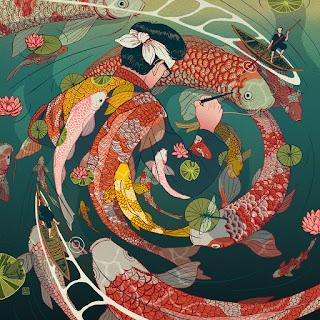
The Rule of Thirds is a simplification of
The Golden Ratio that gives the effect of structure within a composition. The
Rule of Thirds is a grid that divides the artwork into three parts
horizontally and vertically. Application of this rule generally involves
placing the subjects within the intersecting lines of the grid or using the
1:2 ratio technique.
Exercise 1 | Contrast & Gestalt Theory
I wasn't too sure how to carry on and I was left
pretty disappointed with the progress so far. So I traced the shape onto a new
paper and started again.
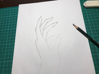
Fig. 2.22, sketch process for new project
Exercise 4 | Harmony & Unity
With these in mind, my idea for this exercise is to create a sense of harmony by arranging different colours together. Below is my initial sketch of this exercise done on Photoshop.
Ms. Maria approved of the sketch and I carried on with experimentation on paper
and acrylic.
Naim Zuki, (0346615) |
Bachelor of Design (Hons) in Creative Media
Design Principles
Exercises
LECTURES
Lecture 1 | Design Principles, Contrast, and Gestalt Theory
What separates design from art is the main purpose of any creation under the intention of designing. The creation of art can be labelled as an interpretive expression that is to be
appreciated, where the artists' mental image of the concept can be achieved in any techniques that adhere to their intended creative expressions.
However, design is art with a specific purpose. Design utilises art and
heavily relies on strategies and principles to accomplish the end result.
Think of it as the difference between how artists and designers
get from point A to point B in their creative workpieces.
To understand the process of designing, we
must first review some common elements and principles that are applied within
design. The Design Elements and Design Principles that will be focused in
class are as follows:
Elements of design - Dots, Lines, Shapes, Forms, Colours, Values, Textures, and Space
Fig. 1.02, What Makes Good Design? (Image Courtesy of Mydee
Lasquite)
A design composition that
works (admittedly art and design are subjective but for ease of
understanding I will be objective in this specific section of my notes) is one
that finds a balance in using multiple elements. Proper coordination and
planning of a project will be received with a positive reaction from the
audience and hence increase the value of the project.
The Gestalt Theory. In its simplest
explanation, the Gestalt Theory emphasises that the human brain is wired into
seeing the world in it's simplest form. That is recognising patterns, logic,
and structure.
Fig 1.03 The Gestalt Principle (Image Courtesy of TipTut)
Contrast. In design, contrast can be
used to guide the viewer's perspective into focusing on certain elements of a
workpiece. The way that this can be achieved is through contrast in shapes,
colours, and lines.

Fig. 1.04, Example of contrast in colour (Image Courtesy of Arantxa)
_
Lecture 2 | Emphasis, Balance, The Golden Ratio, & The Rule of
Thirds
To put it simply, composition is arranging elements in a scene
in a pleasing and easy to read manner. Proper composition within a design can
effectively convey an idea across to the audience. while bad composition tends
to throw the initial meaning off balance or be completely disregarded by the
viewer. The Rules of Composition has been so important within arts and design
that it has been practised all throughout history and the same composition
rules are even implemented today in contemporary design.
The techniques of composition that would be covered in this lecture are
Emphasis, Balance, The Golden Ratio, and
The Rule of Thirds.
Emphasis within Design is where the
artwork's focal elements are at play. Emphasis gives the
subject dominance over every other element that are present in the artwork.
Focal elements that the human eye are naturally drawn to are called
natural focal elements. Few of the natural focal elements would
include high contrast, saturation, camera focus, motion, and faces or figures. However there are
also focal elements influencers which would help subtly guide the
viewers' eyes into the subject; those elements include guiding lines, framing, and geometry.
(Image Courtesy of Tamas Medve)
What works in this example:
- Contrast (silhouette)
- Contrast (silhouette)
- Human Figure
- Leading Lines
- Motion
Balance is where the weight of a
composition complement each other in a harmonious way. Balance can be
divided into two parts, symmetrical and asymmetrical.
Symmetrical Balance has two
categories, which are Bilateral Balance and
Radial Balance. Bilateral balance is represented by having equal
arrangement on either side of the central axis; ie vertically or
horizontally. Whilst Radial Balance has equal arrangement around a
central point.

Fig. 1.08, Example fo Radial Balance, (Image courtesy of Nicolás
Castell)
Asymmetrical Balance is all about
ensuring the visual weight of a design to be evenly displaced. Those that
constitutes as having weight within a visual artwork are
size, high contrast, saturation, faces, or figures. (refer to fig. 1.12 for
example)
The Golden Ratio. Essentially, The
Golden Ratio can be found all throughout nature and it's been widely
accepted as a representation of perfect beauty throughout history
(paintings, architecture, etc) and contemporary design.
As an example for the use of multiple composition rules within one image,
I'll use this picture I took as a reference. The main focal points that I've
added within this shot are camera focus, contrast,
and figures. The structure I've used on this image is the Golden Ratio. For a quick run down, take a look at the man walking away in the
background. His presence in the light adds a heavy visual weight on the
right side of the picture, thus the lady on the left side of the frame acts
as a counterweight to make the shot look more balanced. If you take a look
closely, the lines of the golden ration circulate from the floor to the
walking man, running around the walls and circulating where the lady sits,
adding a sense of structure within this picture.
_
INSTRUCTIONS
Module Information Booklet: Design Principles
<iframe
src="https://drive.google.com/file/d/1Yo-WmZQk9mkHGGBtxY89xxF_V3QyuENr/preview"
width="640" height="480"></iframe>
Exercise 1 | Contrast & Gestalt Theory
Hereafter comes the practical exercise of Gestalt Theory and Contrast. We're
instructed to create art pieces that apply these principles effectively using
only black and white paper.
Gestalt Theory
To commemorate possibly one of the worst ways to start
the decade, I've decided to focus my work on the ever concerning habit of
those with depleting mental health to emotionally self-isolate themselves
during extreme episodes. My inspiration mainly came from those around me (if
not myself) who are dealing with the isolation more seriously than most, thus
this work I adequately named it: Reaching Out.
An element of Gestalt Theory that I've incorporated within this
piece is figure-ground as well as closure. Figure-ground is
represented with how the hand above blends into and compliments the hand
below, signifying the human act of helping those in need. Closure is
represented within the bigger hand on the upper side of the piece, where the
fragments of light insinuate the silhouette of a hand.
Fig. 2.2, Printing outline and cutting
Upon completion of this, I felt a pang of dissatisfaction
over the disorganized look and wondered if I could clean the shapes and
see if I can achieve a different stylized look. Hence, I tried a different
approach. The following (fig. 2.4) is the revised version.
Fig. 2.4, Reach Out (Scanned), 6/9/2020
Contrast
As for contrast, I faced a bit of a creativity block.
Hence, into the Pinterest rabbit hole I go to find my sources of
inspiration. The following is what inspired me from most.
For the sake of staying within the theme of mental health,
I've decided to design a piece that shines a light into my interpretation of
how isolation feels. Visually, the contrast lies within the colours of the
lights and shadows. Emotionally, the contrast lies within the simplicity of
the work and how isolation tends to result in the opposite and creates more
emotional complications. Presented below (fig. 2.6) is the sketch I made on photoshop.
_
Exercise 2 | Balance & Emphasis
This week we were tasked to create artworks that represent
Balance and Emphasis using markers, pens, and colour
pencils.
Balance
As the weathers change. the winds carry the
colours of rain and the clouds paint the sky in hues of blue, pink, and
orange. New colours enter our small comfortable atmosphere of Malaysia
bringing a new season of change. Thus, much like this new climate of cold air
and rainy nights, new colours have also entered our work; bringing an end to
the monotone of black and white paper.
Asymmetrical Balance
The main material that I've decided to use for this exercise
are markers. Mainly due to the fact that markers provide a bigger surface
area to work with and would help with the time constraints. However, I am
are very unfamiliar with the dynamics of markers and hence this has been a
very (frustrating) experimental exercise.
That aside, my main inspiration for this week's
exercise is this shot from the Joker movie.
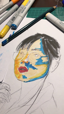
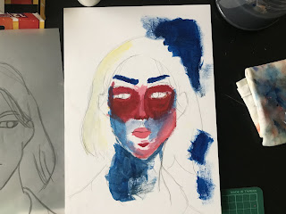
What caught my eye is how the lighting in
this scene focuses on the balance between the cool and warm tones from both
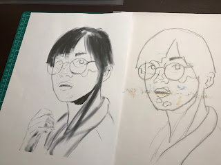
sides of Joaquin Pheonix's face. I decided to use this picture of a girl I
took a while back.
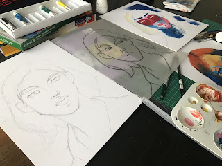
From here, to save time on experimenting, I've transported
the sketch onto paper to fully explore how I'd approach this piece with
markers.
All in all this project has been thoroughly stressful. There
were many imperfections that I wished I had the time to explore and
develop. However, the experiments were in fact fruitful. I've gotten used
to the markers and have a slightly better intuition when using them. Thus
as extra work, I tried experimenting with the material a bit more.

Fig. 2.22, sketch process for new project
Symmetrical Balance
With the same main source of inspiration in mind (Joaquin
Pheonix in Joker), I've visualised my symmetrical piece to show symmetry in
colours on a facial figure. I imagined it to divide a face down the middle
into two moods; one side blue, the other radiant. Since it was fitting with
the colour scheme, the blue side of the face represents a crying face while
the other has a somewhat angry aura. A classic way of representing mixed
emotions through graphical artwork.
Emphasis
When I first heard about emphasis I knew
exactly something that I have to draw. Once again, I'll be stylising a picture
I took.
Fig. 2.29, Photoshop sketch
_
Exercise 3 | Movement & Repetition
This week we were tasked to come up with designs that reflect
Movement and Repetition using watercolours or
pastels.
It's been a while since I've touched watercolours. Around 5 years ago (at
least) was my last attempt in painting something. Back then I had no
motivation to practise painting so I completely abandoned any thought of using
watercolour; or any sort of paint for that matter. So reintroducing myself to
the childish joys of watercolours in this exercise was definitely refreshing
to go through.
Movement
Initially, I wanted my work to be a minimalist topography design. Below is my
initial sketch done on Photoshop.
Though afterwards, I've realised that recently I have been heavily drawn to
bodily movement. I find that expressionist painters represent movement in such
an attractive way that it draws my attention into how an artwork can be
interpreted. However, upon seeing my sketch, Ms Maria expressed that my idea
doesn't represent movement within a Design context enough for it
to be satisfactory.
Upon hearing the feedback, I did a little self-reflection to see what I
consider to be a proper representation of movement. This was when I
came upon the motion of clothing and smoke. The following were the biggest
influencers of the final outcome.
Now it's time to whip out my brother's years old elementary water colouring
set and get down to experimenting. Being my first time painting in a while, I
first experimented with how to play with tones within a monotone colour
scheme.
At this point, I've gotten the hang of brush strokes and a couple of water
colouring techniques. So I started with my final work.
Repetition
In this part of the exercise, I wanted to make something stylised and thought
immediately of Avatar: The Last Airbender's final fight scene between Aand and
Firelord Ozai.
Fig. 2.46, Landscape inspo; Monument Valley, (Image Courtesy of
Elli Elison)
Now that I've gotten the hang of water colours and brush control, this
process went way faster and easier than the previous design. My approach
painting this was to focus on the shapes and tones, so I didn't start with
an initial sketch because I wanted it to look and feel more natural.
added the torn clothing at the top as emphasis on subject and added
dramatic effect
This week we were tasked to come up with designs that reflect
Harmony and Unity using acrylic paint.
Harmony
Harmony
Putting last week's water colouring efforts into mind, I began the exercise by
looking into inspirations where I could break out from painting in monotone
and challenging myself to be more experimental.
With these in mind, my idea for this exercise is to create a sense of harmony by arranging different colours together. Below is my initial sketch of this exercise done on Photoshop.
Now as per usual, I didn't know how to work with this medium or how different
acrylic is compared to watercolours so it took me a while to get used to the
different techniques available. I managed to do some research on brushing
techniques to get the different tones right and how to blend the colours
together. After a while, I got the hang of it and got a groove going.
Now with that, I proceeded to paint little by little, making sure I won't screw
up anything.
Unity
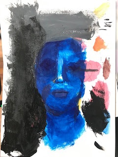
For Unity, I wanted to go with the idea of a person's emotional unity. I want to reflect that idea with using monotone values. I first started with sketching out a face and tried colouring it but I screwed up the painting and so I just improvised my way through and ended up with something abstract.
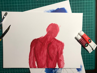
Knowing I couldn't submit this in, I tried again but this time I tried a different approach. I wanted to paint a figure facing away from the canvas, as if walking away in anguish. My narrative would be he's facing a sense of acceptance with himself, relating back to the idea of a person acceting his own emotional conscience, or in other words, creating an emotional unity within himself.
Fig. 2.59, Painting development, 28/09/2020
_
Exercise 5 | Symbols & Imagery
This week, we were tasked to make a design of a symbol using digital softwares and make a collage that reflects Imagery.
Symbols
At the start of this exercise, I was being a bit of a geek and plunged myself deep into the fanart collections of Destiny 2. While going through these submissions, I realised that the developers of the game must have spent some time designign the symbols in this game because each and every one of them are so expertly designed.
With this in mind, I started with a couple of sketches with the same style-ish in mind.
I didn't feel too happy with these designs cause it just felt like they weren't my thing. So I scrolled through more Destiny 2 symbol designs and found that I am loving their Faction Symbols design. Then I went into designing my own little faction design for their Hunter class. I used the tip of an arrow as my main reference and started the designing process.
Imagery
Since my work for symbols had something to do with a game, I thought it'd be a nice if I stuck to the theme and worked off of something that was inspired by games as well. Which is a very convenient thing because me and my older brother have a stash of old gaming magazines in his room. So I dugged out the magazines and flipped through the hundreds of pages to find something that could inspire me. I stumbled upon some of pages the magazine company wrote during the launch of The Last Of Us and I was inspired by the zombie apocalypse. I wanted to do classic lore-related collectable materials that are often famous in open-world video games, so I cut off a page off my old journals to mimic the "letters left behind" collectables from The Last Of Us. I managed to piece together something a little more abstract.
_
FEEDBACK
Week 1
Upon viewing my blog, Ms. Maria commented on the
imbalance of words and graphical content that I've included in my
notes as well as my documentation of the Gestalt Theory/Contrast
exercise. She explained that adding more visuals would paint my blog
in a better light and provide a more comprehensive reading experience.
She suggested that I add more pictures, which I've followed and
incorporated more within this blog.
As for the exercise, after reviewing the first draft
of Reaching Out, I've decided to rework and apply a different style
to the work. Ms. Maria responded positively to the newest work and
I've decided to keep that as my final outcome.
Week 2
Week 2
Ms Maria reacted positively to the idea of my first
piece and approved it without further comment.
As for the second sketch, she suggested that I
develop it a little more to make it look less clustered and more
well defined. Which I've implemented by removing most of the
background and using it as negative space to put the subjects
more into focus.
Week 3
Week 3
When I showed Ms Maria my initial sketch for
Movement she was perplexed at the simplicity and admitted
that it was not satisfactory and expressed that she expected
better. She explained that the first sketch was too simple of an
idea and advised me to revise the design. As for the second
sketch, she explained that it doesn't represent
movement well and suggested that I revisit the sketch
with mayhaps a different idea.
Week 4
For the small sketch I did for unity, Ms Maria questioned my intentions behind it, but otherwise was satiesfied with my direction and motivated me to continue on developing it.
Week 5
Ms Maria's reaction to my sketches for the symbols was a bit funny, she said that the Danger symbol sketch was really similar to a previous sketch I had and I laughed cause I got caught of not being visually creative. Anyway, she preferred the Danger sketch but suggested I do some more experimenting to expand my style.
_
REFLECTION
Week 1
This particular module took me a bit of getting used
to. Taken into account I enrolled late, I was pretty much left
clueless to how the course is conducted and thus resulting in me
having to do a bit of catching up to as well as constantly going to my
classmates and asking questions about the subject. To my
gratification, my classmates and lecturers have helped me a lot in
understanding the topics explained and I find that this week's lecture
focuses heavily on how design can be interpreted.
What strikes me the most is how simplicity is often a
necessity in making others understand what a particular design is. The
theory and principles that were presented this week has broadened my
understanding of human perception and thus influenced me in
experimenting with the possibilities of portraying messages in
interesting ways.
Week 2
This week's process was thoroughly stressful for me
to follow. My experience in visual arts so far has lead me to
understand relationship between colours through photography, so
drawing them from a blank piece of paper was definitely a
challenge.
I seeked out multiple feedbacks from a number of people
I know, classmates and old mates included. Studying the nuances of
human skin was probably a daring choice as an introduction to markers
but it was definitely interesting learning the strokes and techniques
of using markers properly.
Week 3
Week 3
Unlike last week's stressful experimentation, this week
had a more positive experience. Despite my craving to include a bit of
expressionism within my work this week, Ms Maria's outlook on a more
refined piece of design made me challenge my technical skills (which
prior to this week was practically non-existent) in panting. The extra
time I put into getting a hold of painting paid off well and I'm happy
with the outcome.
Recently in order to put my visual thoughts onto paper,
I've started to see the world in shapes rather than lines which helps me
understand depth, lighting, and volume more. Therefore, I find that out
of all three exercises, I'm most fond of toying with ideas in
watercolours more because it allows me to put shapes onto
paper instead of lines.
Week 4
The experiments I did with acrylic this week was really fun. I didn't know what to expect from this medium to be honest so I really just went crazy with what I had, which is kind of a bad idea because one acrylic paper costs five ringgit. But anyway, painting the first composition was super duper exciting because I got to see factual evidence that I've been improving my traditional art techniques.
Week 5
This week I was a bit too occupied with trying to catch up with every other modules and never really had the time to think on my designs, so I was a bit disappointed with the outcomes. So I'll try better in the upcoming projects.
_
FURTHER READING
Week 1
Elements and Principles of 2D Design by Ellen Mueller
Week 2
Habits of Effective Artists by Andrew Price










Comments
Post a Comment